Visual Flow Builder
INTRODUCTION: Getting Started is Easy!
Welcome to Messenger Bots Flow Builder. This documentation guide you that how you can effectively use the Flow Builder feature.
Get Started
In this section, we will be introduced to the features that come with Messenger Bot Flow Builder. So let’s start.
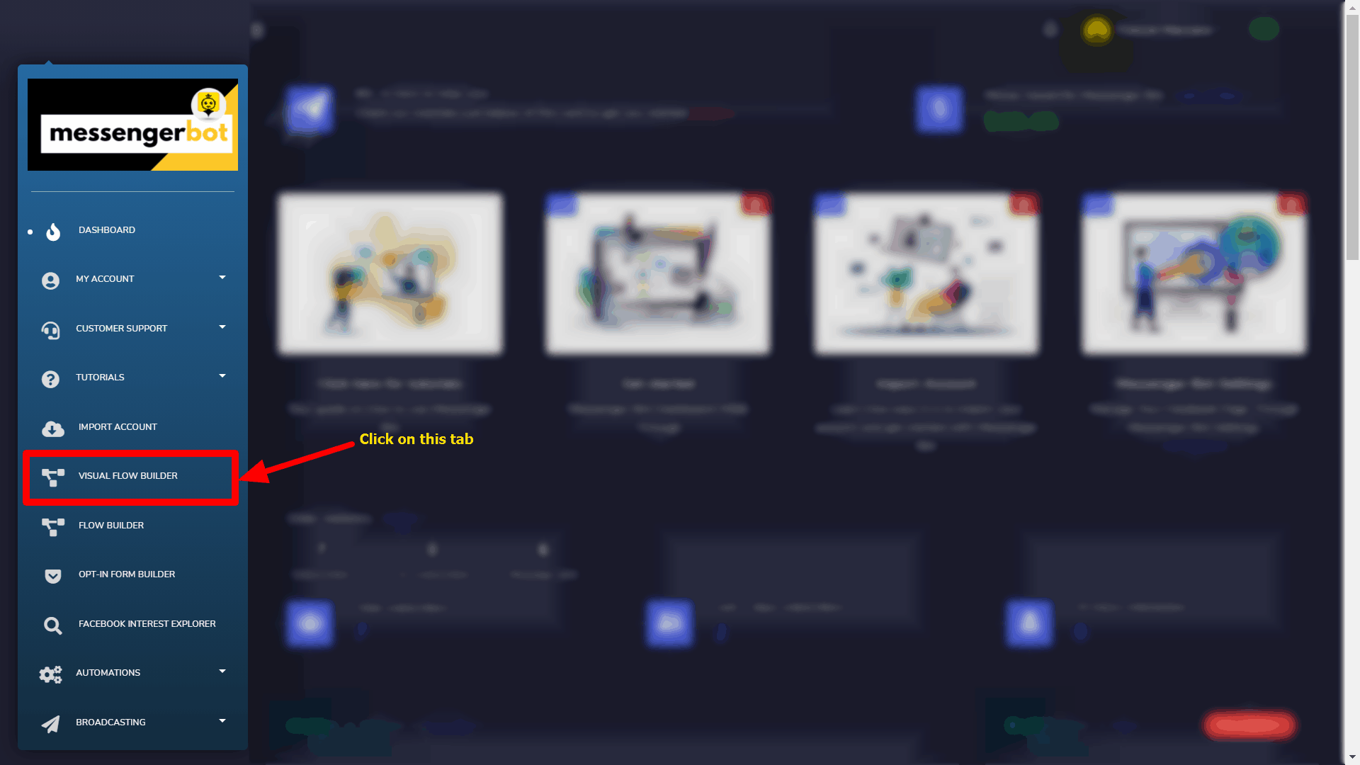
Click on the Visual Flow Builder menu in your dashboard on your left.
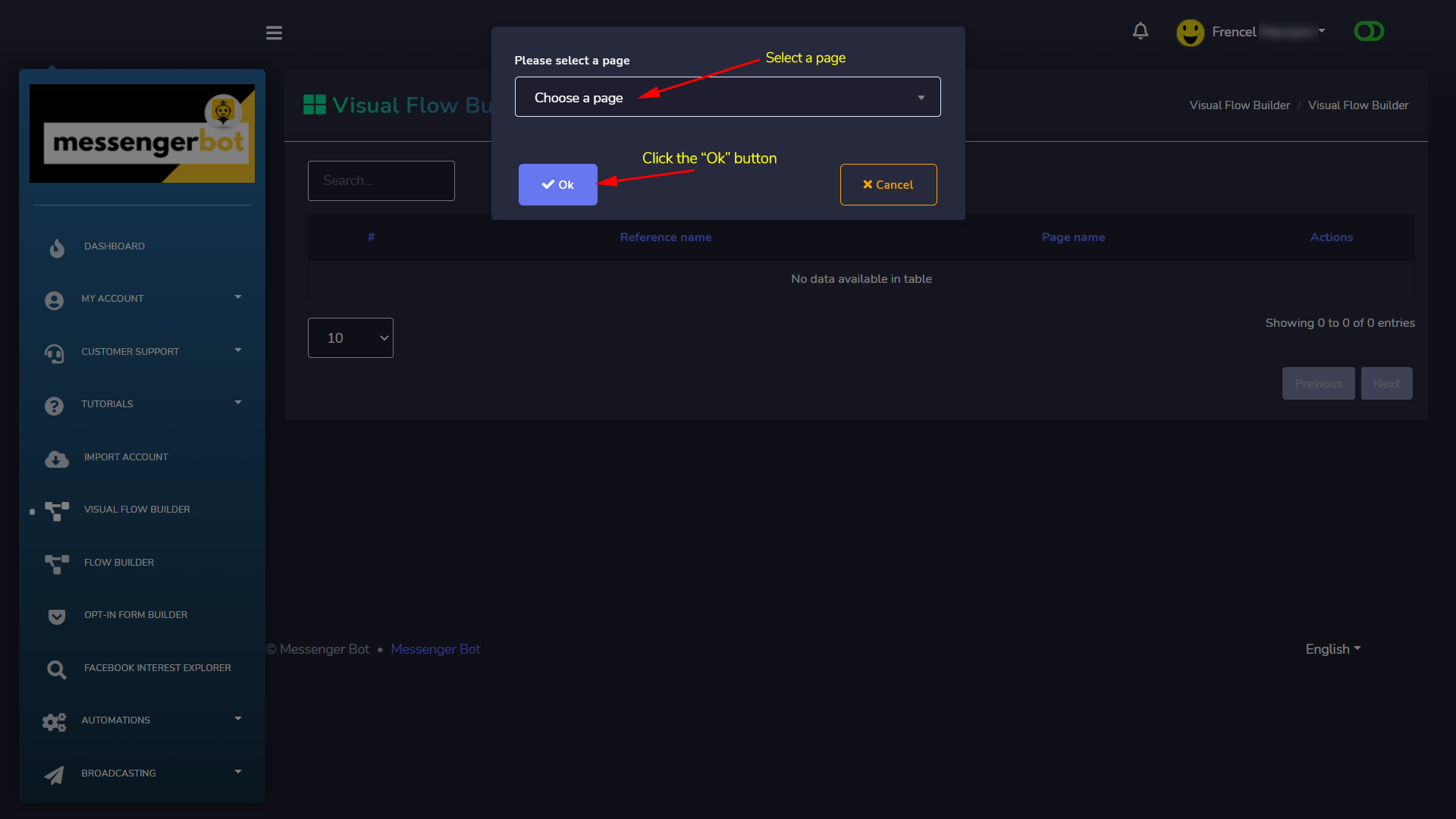
Click again on the Create new flow button and select the Facebook page you want to create a bot for.
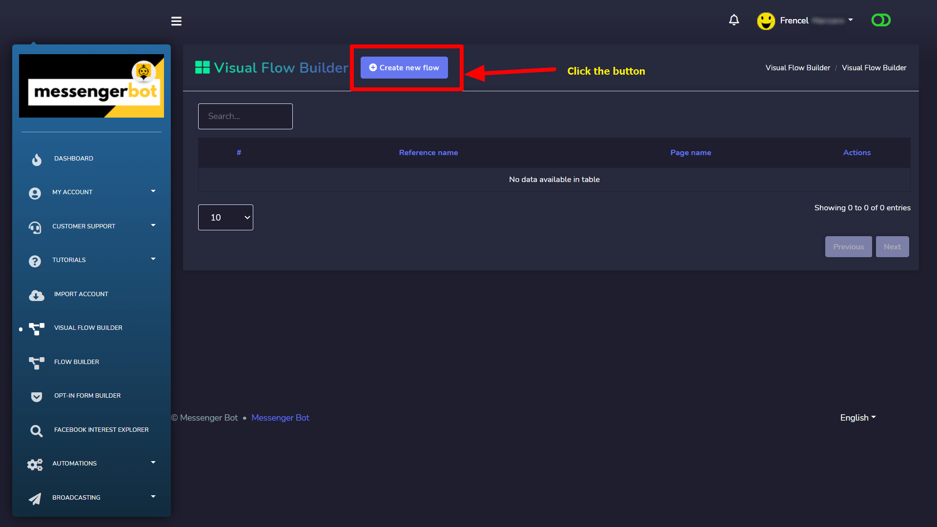
Now, click on the Ok button.
It will then take you to the visual flow builder interface like the screenshot below:
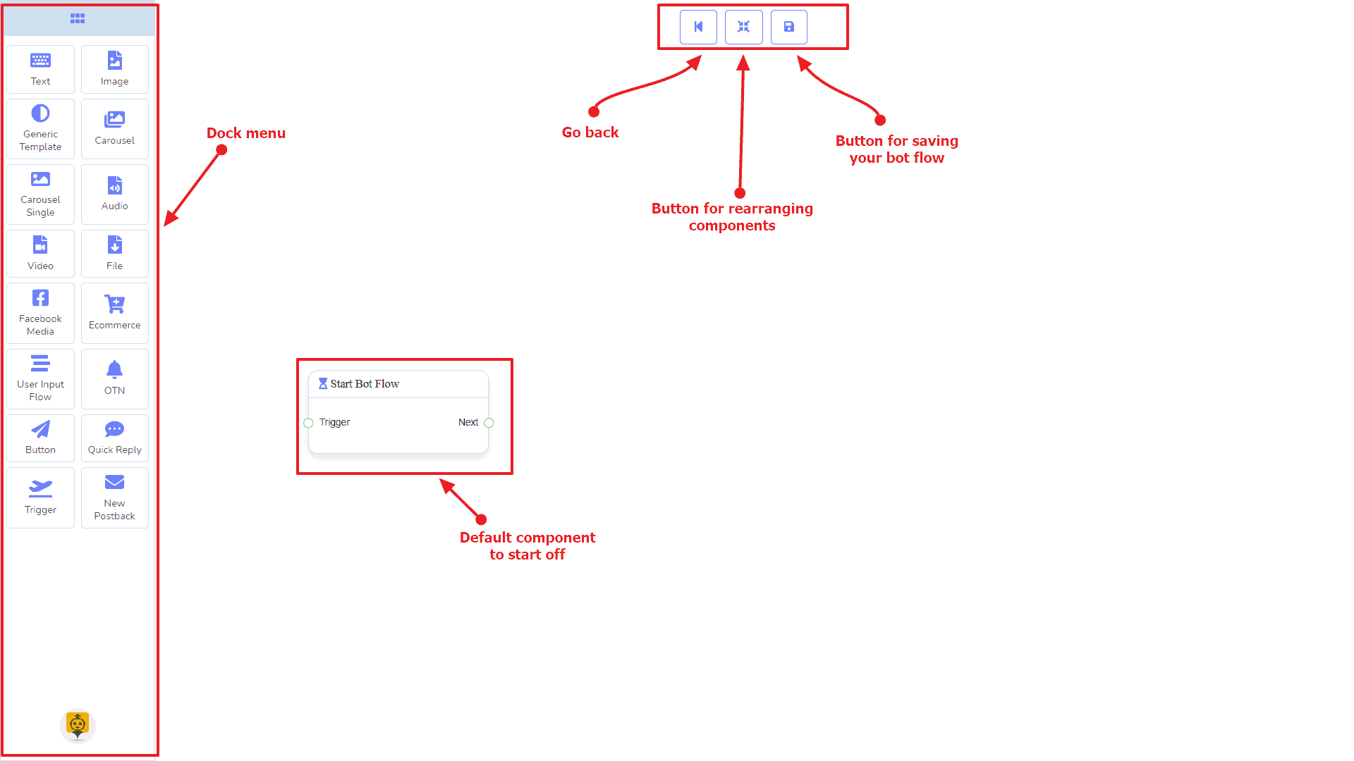
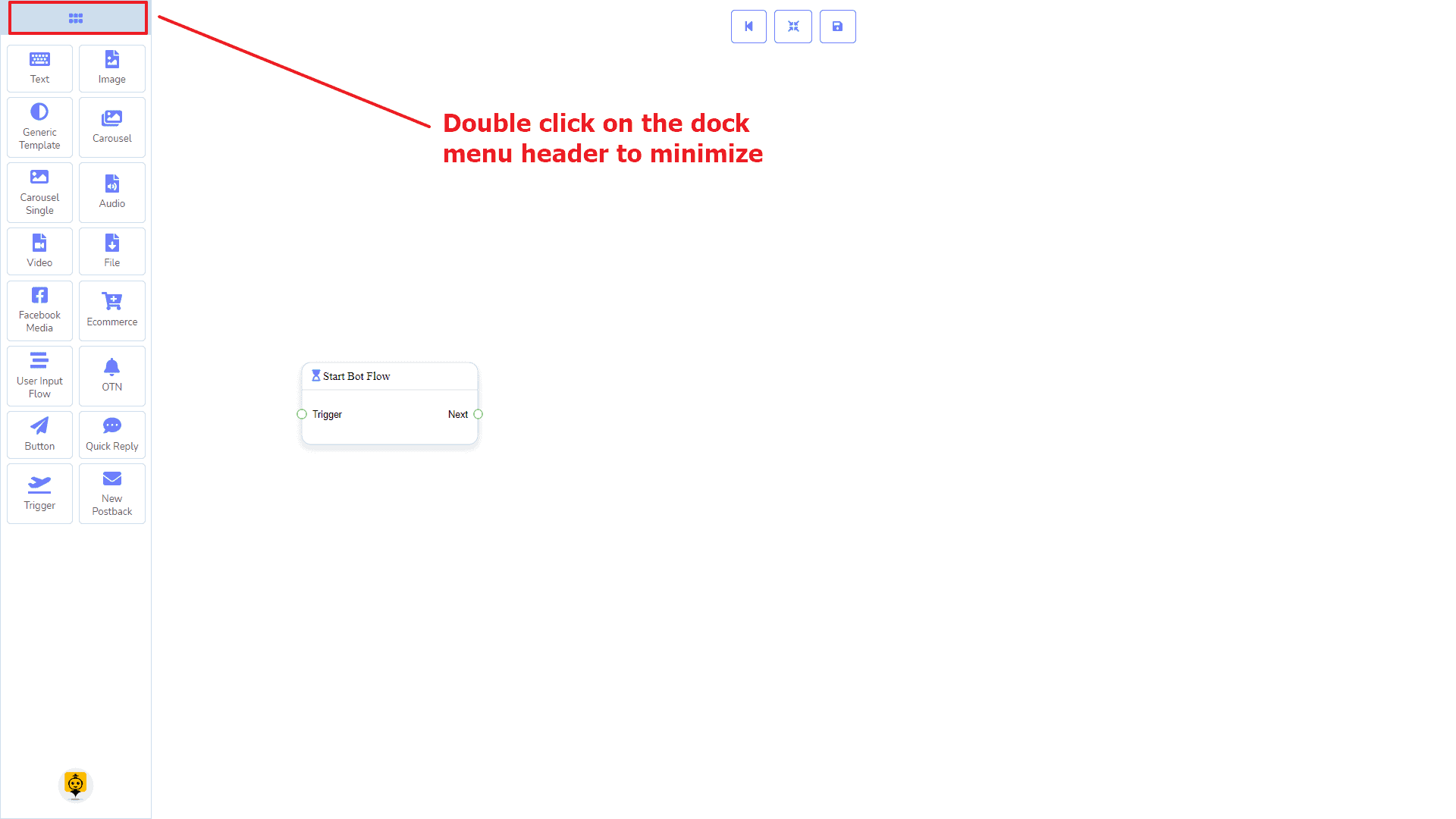
Now you can see the dock menu marked in a red box. From this dock menu, you can drag the Text component and drop it on the editor at any place.
Dock Menu contains components. You can use them arbitrarily to create your bot flow. No matter how long the bot flow is. So, you can reuse those components again and again.
The dock menu comes with the following components:
- Text
- Image
- Generic Template
- Carousel
- Carousel Single
- Audio
- Video
- File
- Facebook Media
- Ecommerce
- User Input Flow
- OTN
- Button
- Quick Reply
- Trigger
- New Postback
The can be moved over to the editor. Grab the dock menu’s header by the mouse pointer or any position with the components and try to move the mouse position. Thus you can put it where you like to.
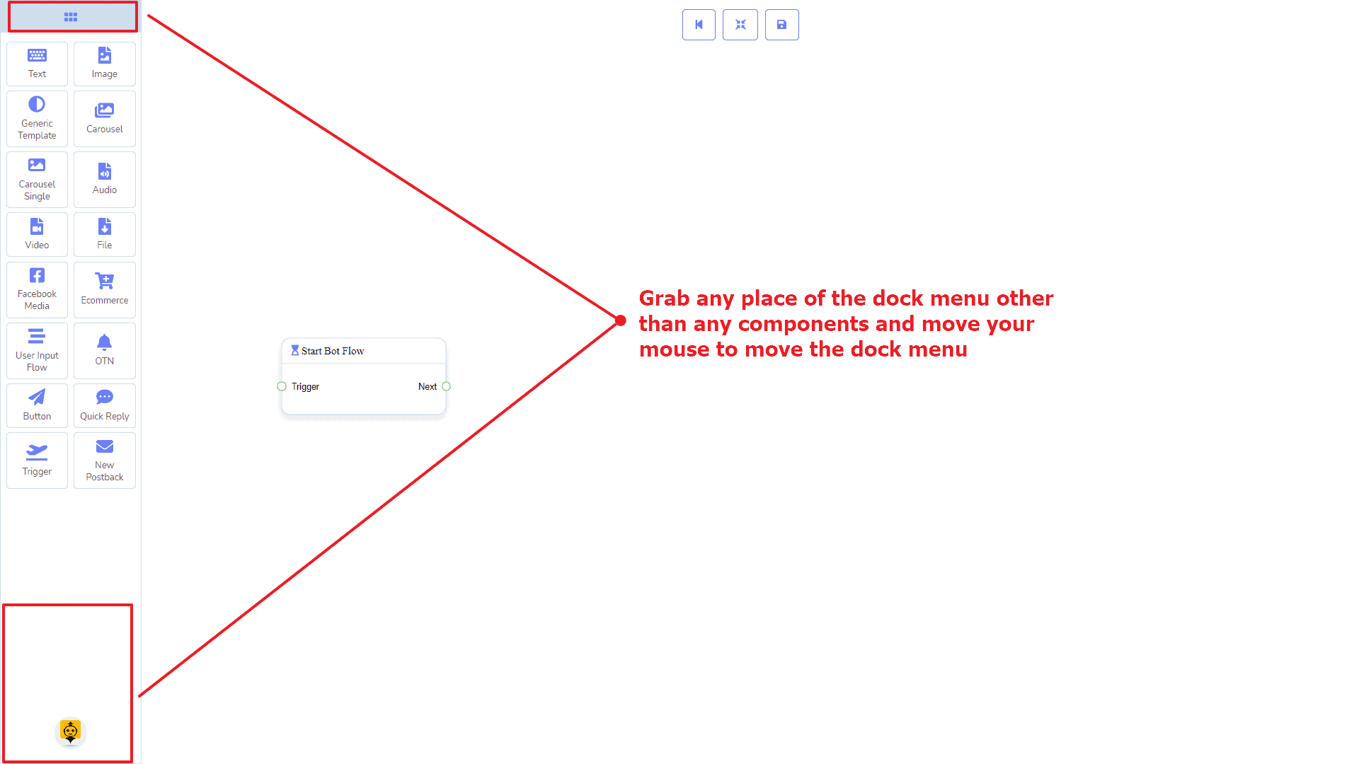
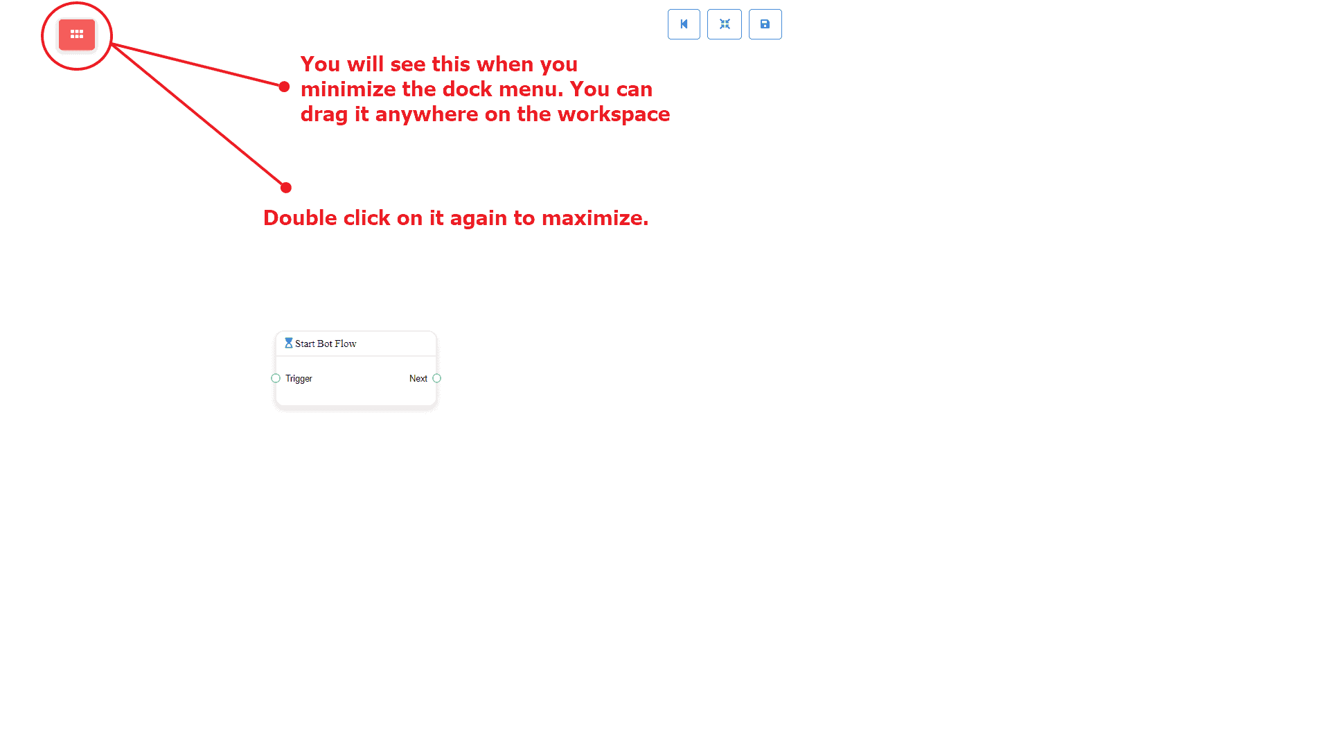
To minimize the dock menu, click twice on its header. You will see a tiny red box after minimizing the dock menu. Click twice on it to reopen the dock menu again.
Trigger Component
Introduction
The Trigger component will allow you to get started with the bot. All you need to connect it to a Start Bot Flow or New Postback. It has only 1 output socket.
- Output: Next
Connections
Next may be connected to one of the following components:
- Start Bot Flow, and New Postback
How to create a Trigger component
Let us see how we can get started a bot.
Dragging and Dropping
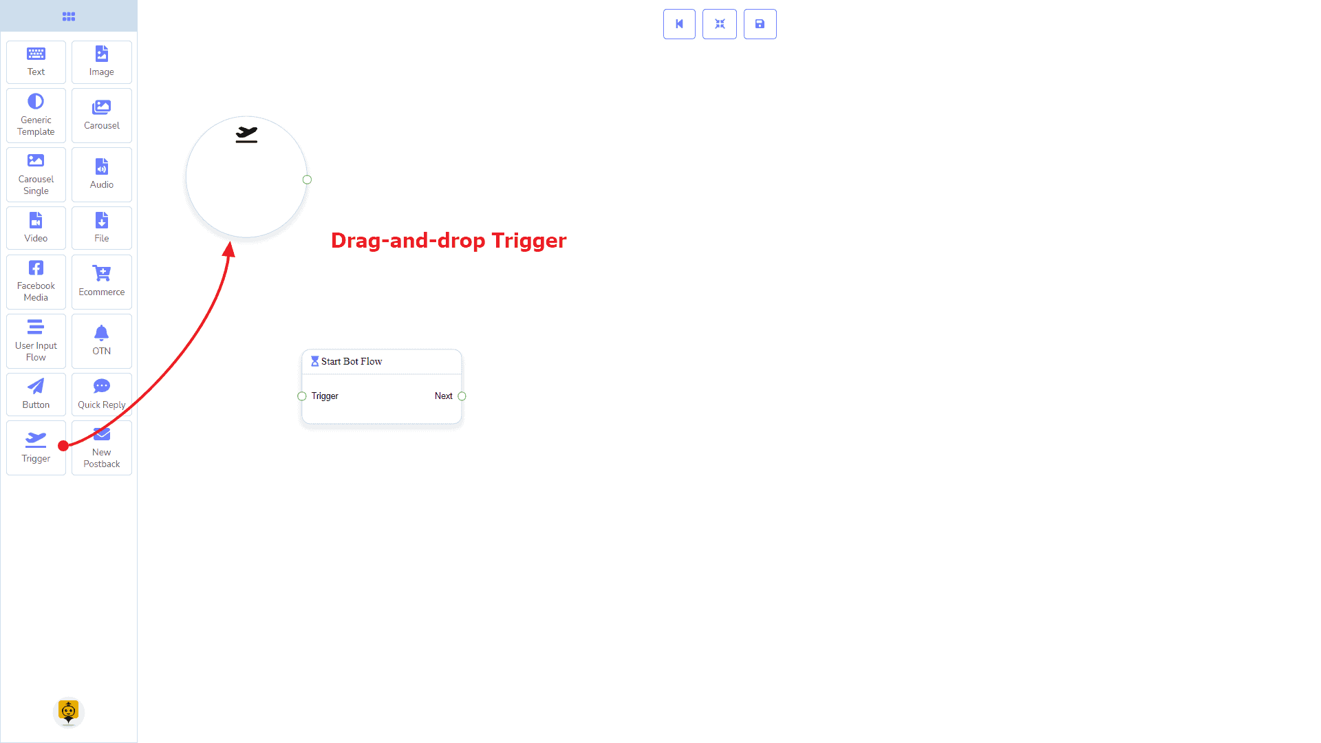
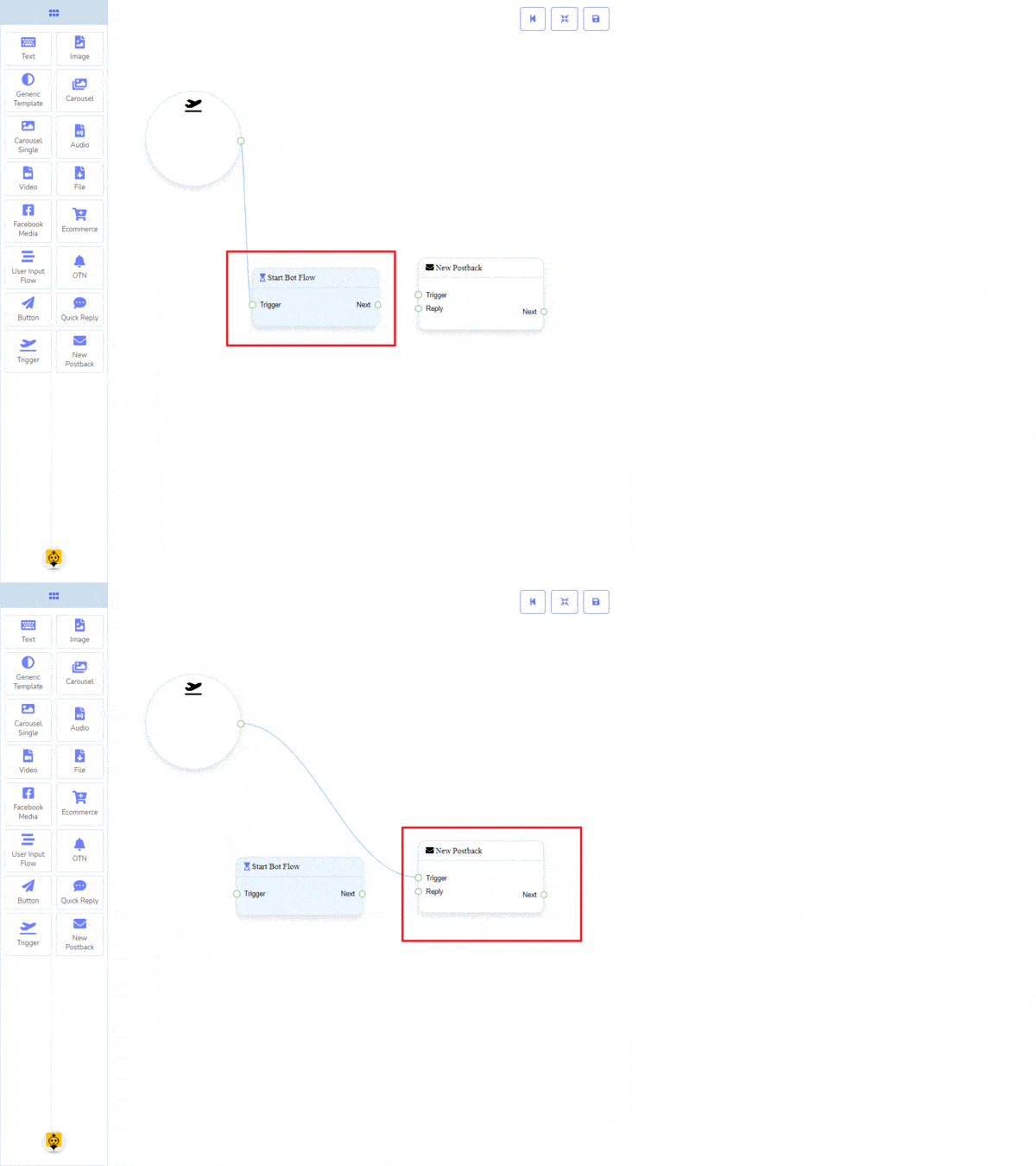
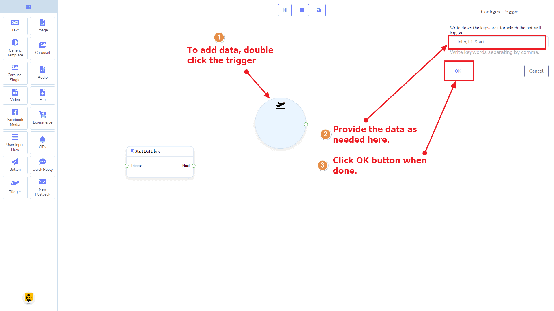
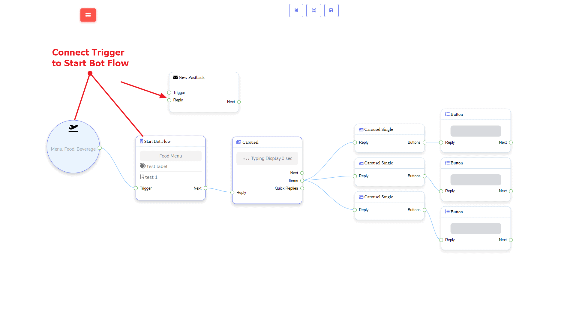
From the dock menu, drag the Trigger component and drop it on the editor and connect to either Start Bot Flow or New Postback component. Once you’re done with making the bot. Save the bot flow and start with a messenger.
Adding Data
To add data to the Trigger component, click twice on the body of the Trigger component. It will open a sidebar on your right. Now provide some keywords there separating by a comma. In our case, we’re providing single keyword products. Now click on the OK button.
Then connect it to either Start Bot Flow or New Postback component.
New Postback Component
Introduction
The New Postback component will allow you to make multiple postbacks through a single bot flow. Each postback will be stored as a standalone postback under the hood. So, you may trigger them later via trigger components if you want. It has 1 input socket and 1 output socket.
- Input: Reply
- Output: Next
Connections
The Reply may get a connection from one of the following components:
- Quick Reply, Button, and Trigger
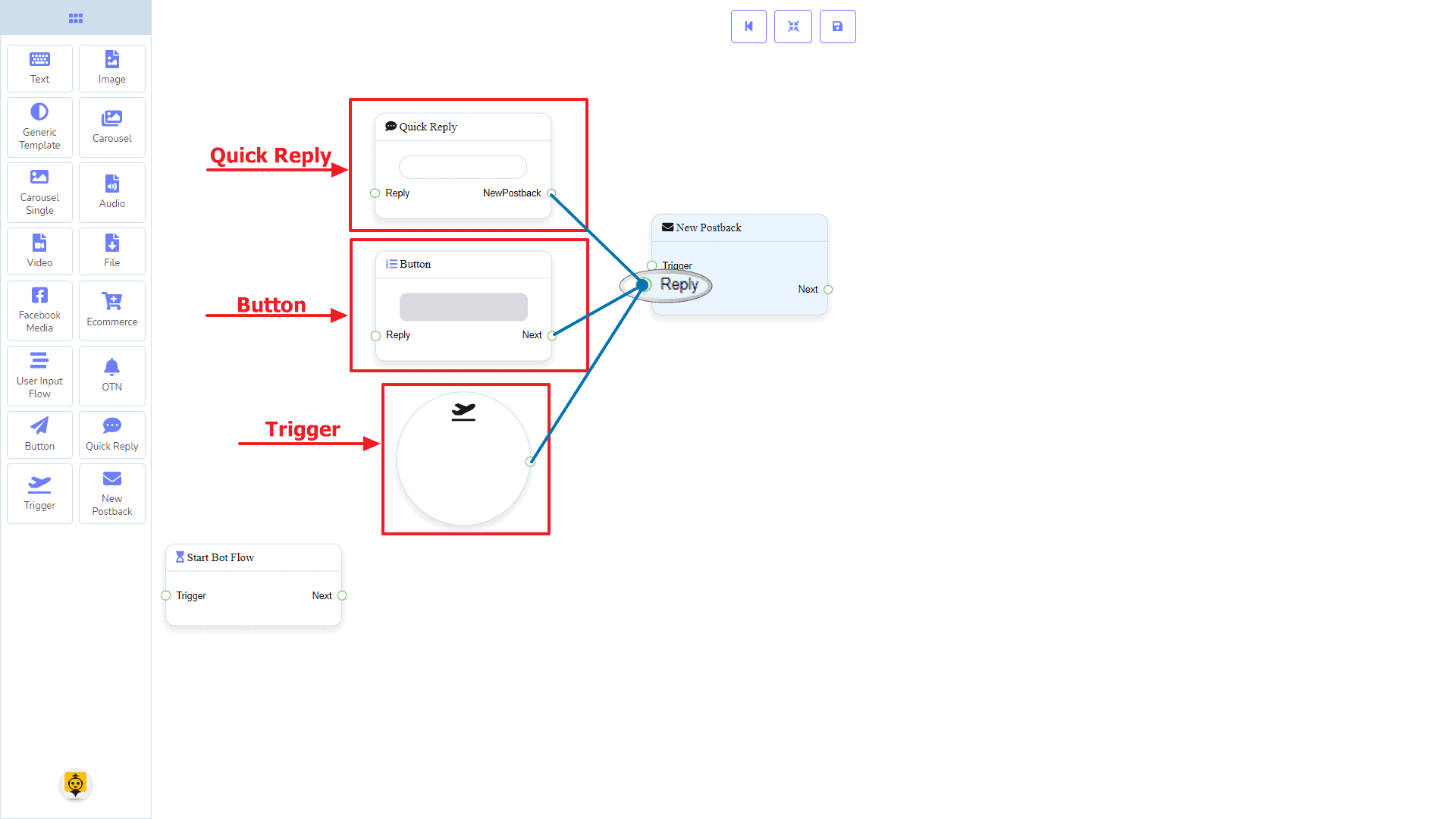
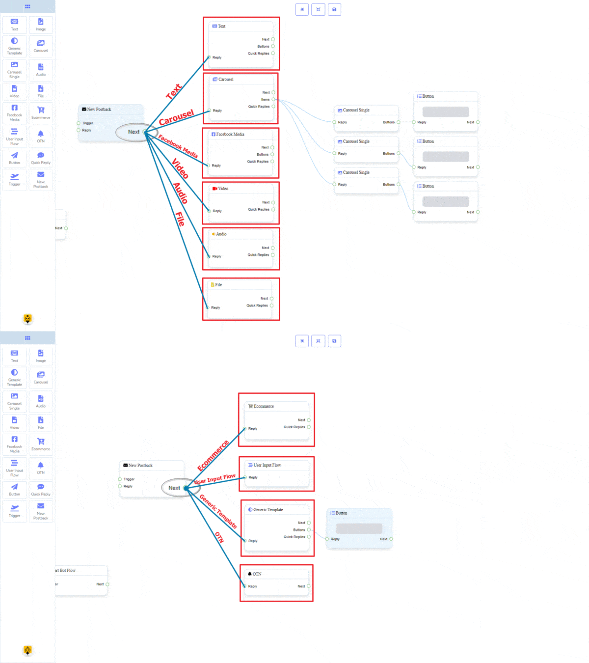
The Next may be connected to the following component:
- Text, Carousel, Facebook Media, Image, Video, Audio, File, Ecommerce, User Input Flow, Generic Template, and OTN
How to create a New PostBack component
Let us see how we can create a new postback component.
Dragging and Dropping
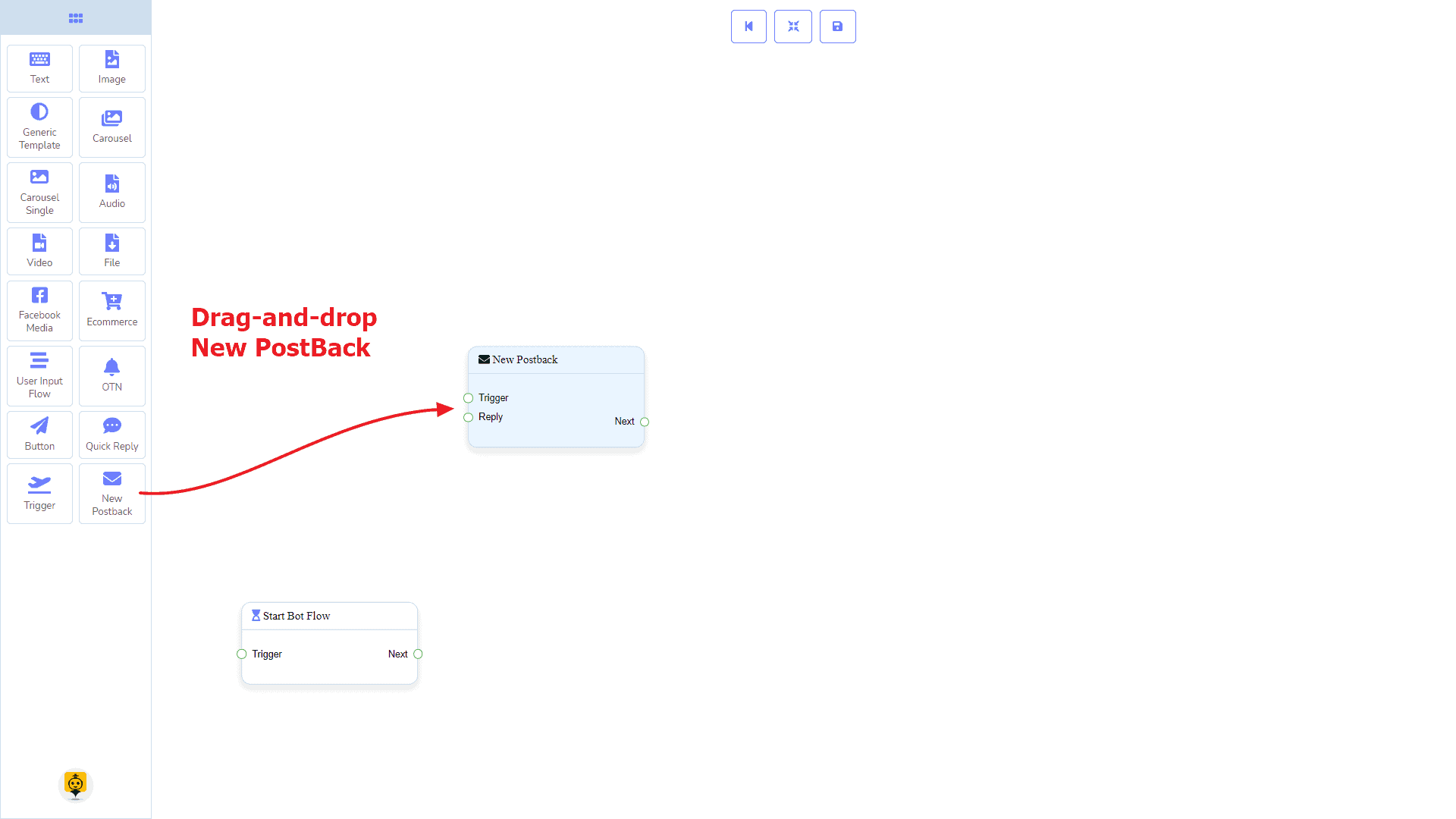
From the dock menu, drag the New Postback component and drop it on the editor at any place.
Adding Data
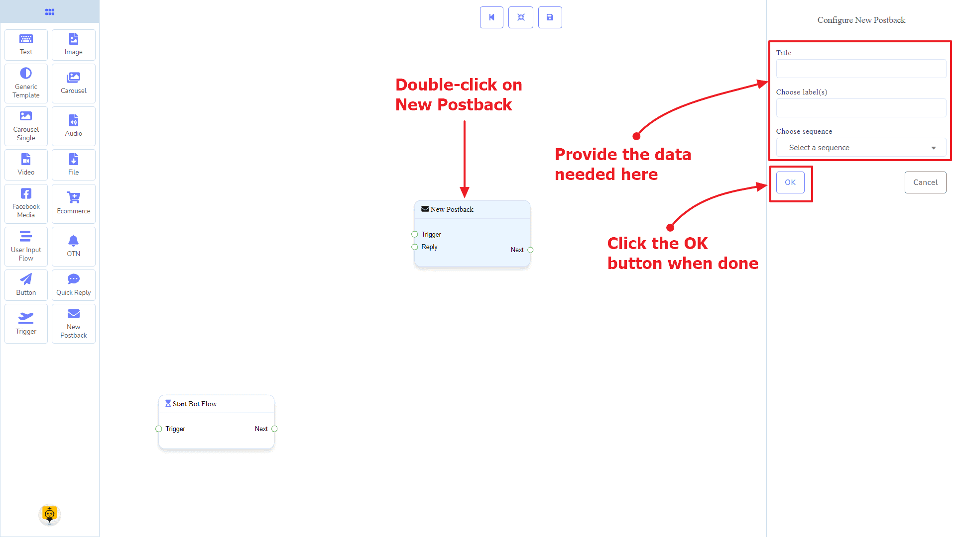
To add data to the New Postback component, click twice on the body of the New Postback component. It will open a sidebar on your right. Give it a name. You may choose a label(s) or sequence if you need.
Once done, click on the OK button.
Text Component
Introduction
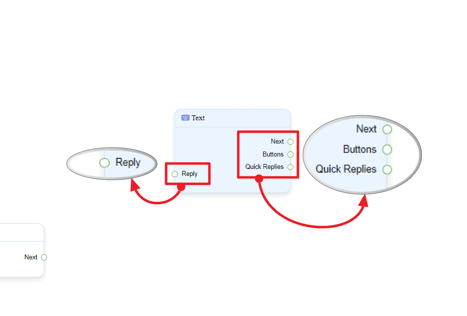
The Text component will allow you to reply with text content only. It has 1 input socket and 3 output sockets.
- Input: Reply
- Output: Next, Buttons, and Quick Replies
| Note: Next to Quick Replies!? |
| There is a condition between Next and Quick Replies. Using either Next or Quick Replies, you can connect to other components. But you can’t connect to others from both. |
Connections
The Reply may get connection from one of the following components:
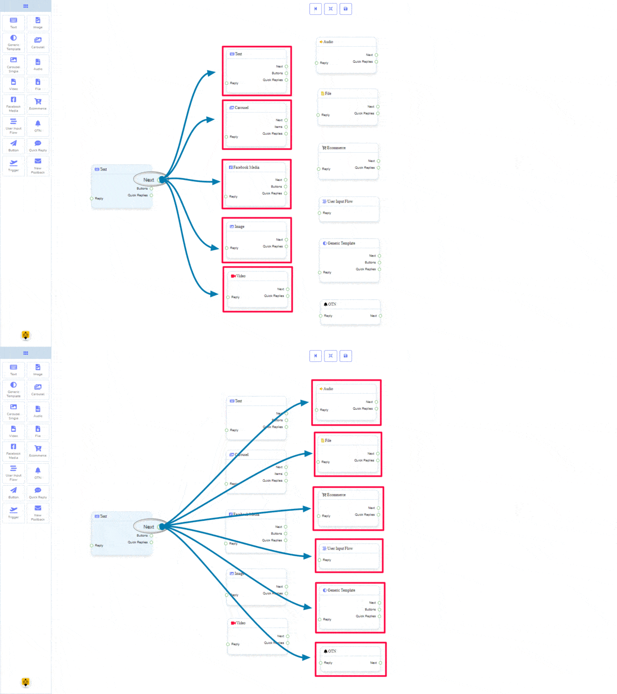
- Start Bot Flow, New Postback, Text, Carousel, Facebook Media, Image, Video, Audio, File, Generic Template, Ecommerce, and OTN.
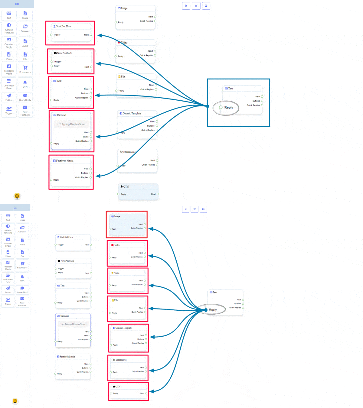
The Next may be connected to the following component:
- Text, Carousel, Facebook Media, Image, Video, Audio, File, Ecommerce, User Input Flow, Generic Template, and OTN
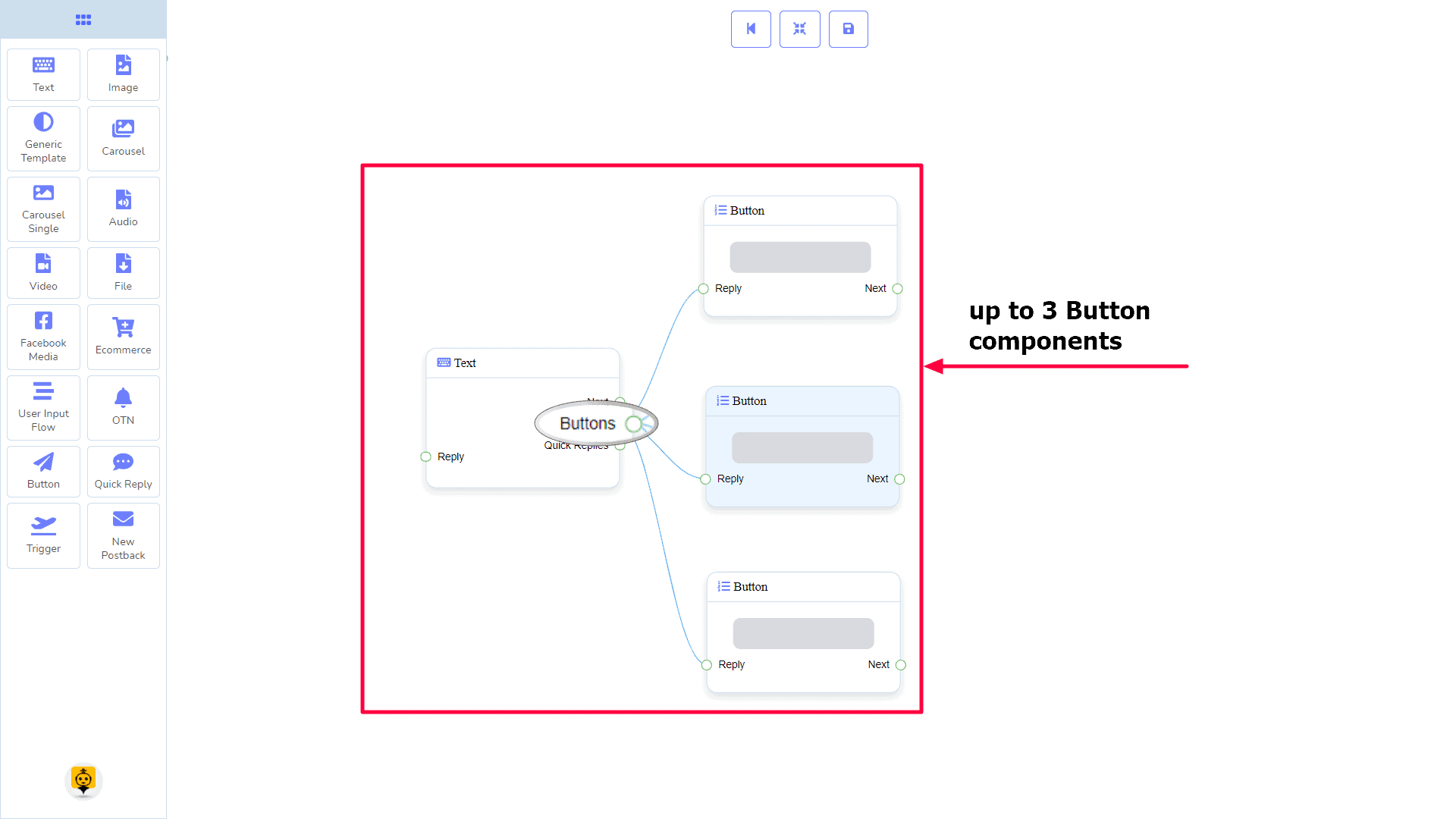
Buttons may be connected to the following component:
- Button – you may connect up to 3 Button components to the Text component.
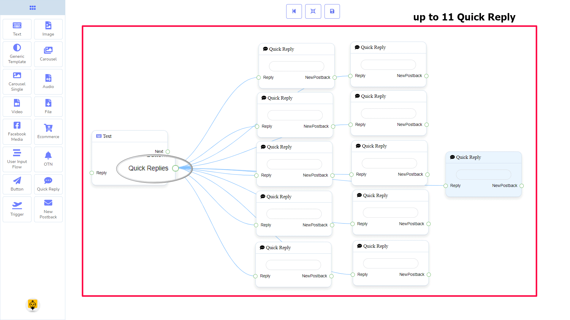
Quick Replies may be connected to the following component:
- Quick Reply – you may connect up to 11 Quick Reply components to the Text component.
How to create a Text component
Let us see how we can create a reply with text.
Dragging and Dropping
From the dock menu, drag the Text component and drop it on the editor at any place.

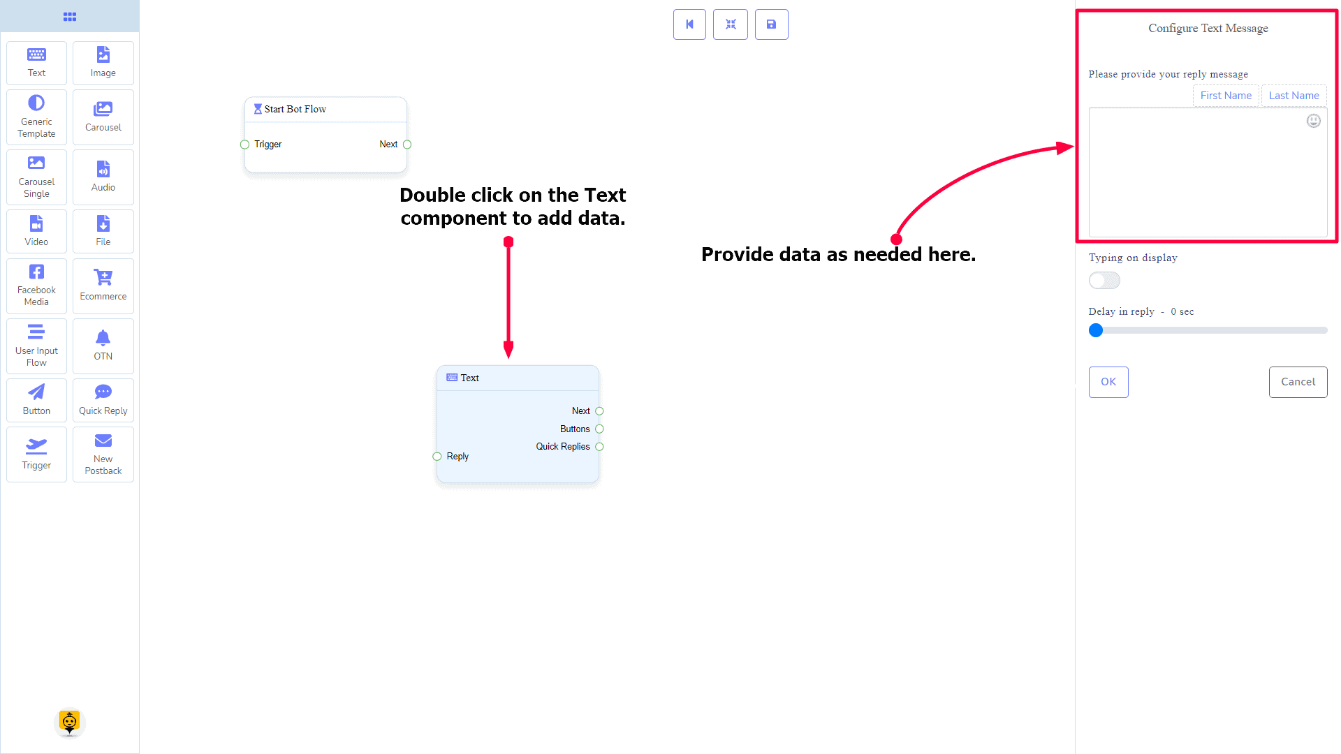
Adding Data
To add data to the Text component, click twice on the body of the Text component. It will open a sidebar on your right. Fill in the fields that you need.
Delay in Reply
If you want to show the typing state on the bot or delay in replying, then you can use those fields.

Image Component
Introduction
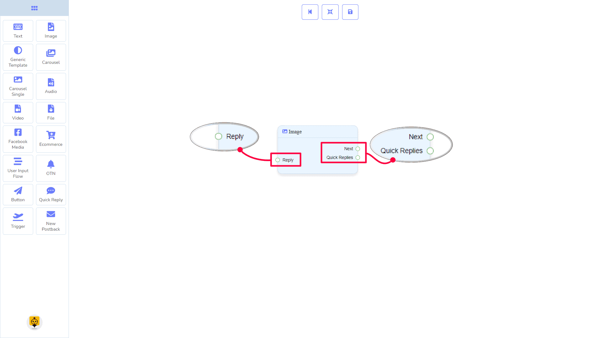
The Image component will allow you to reply with an image. It has 1 input socket and 2 output sockets.
- Input: Reply
- Output: Next, and Quick Replies
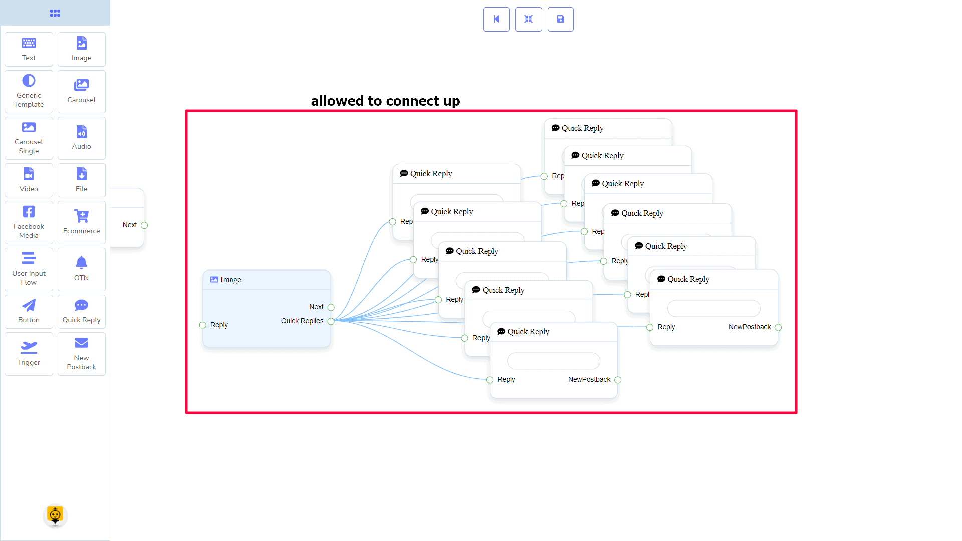
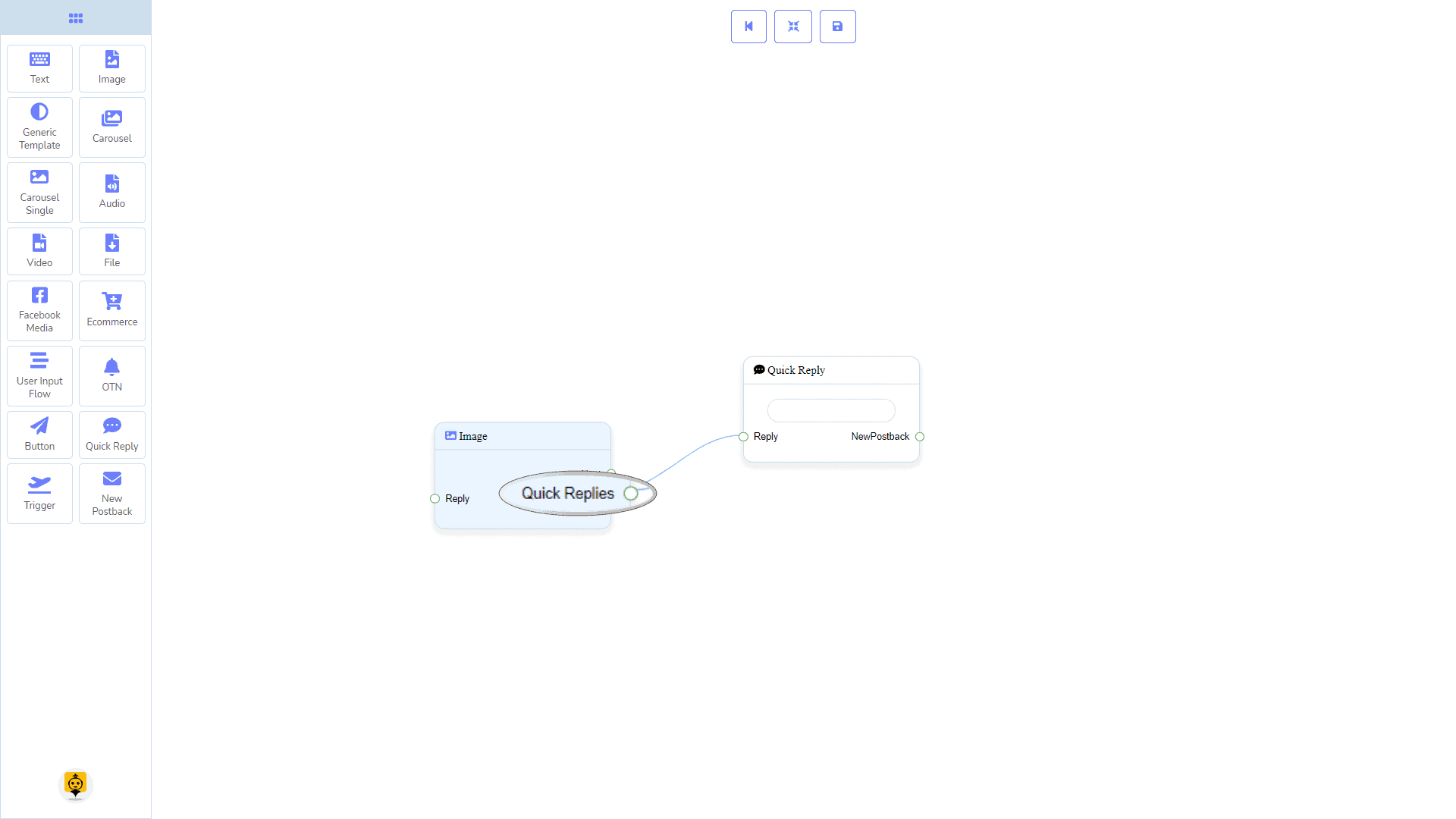
Quick Replies: You can connect up to 11 Quick Reply components to the Image component.
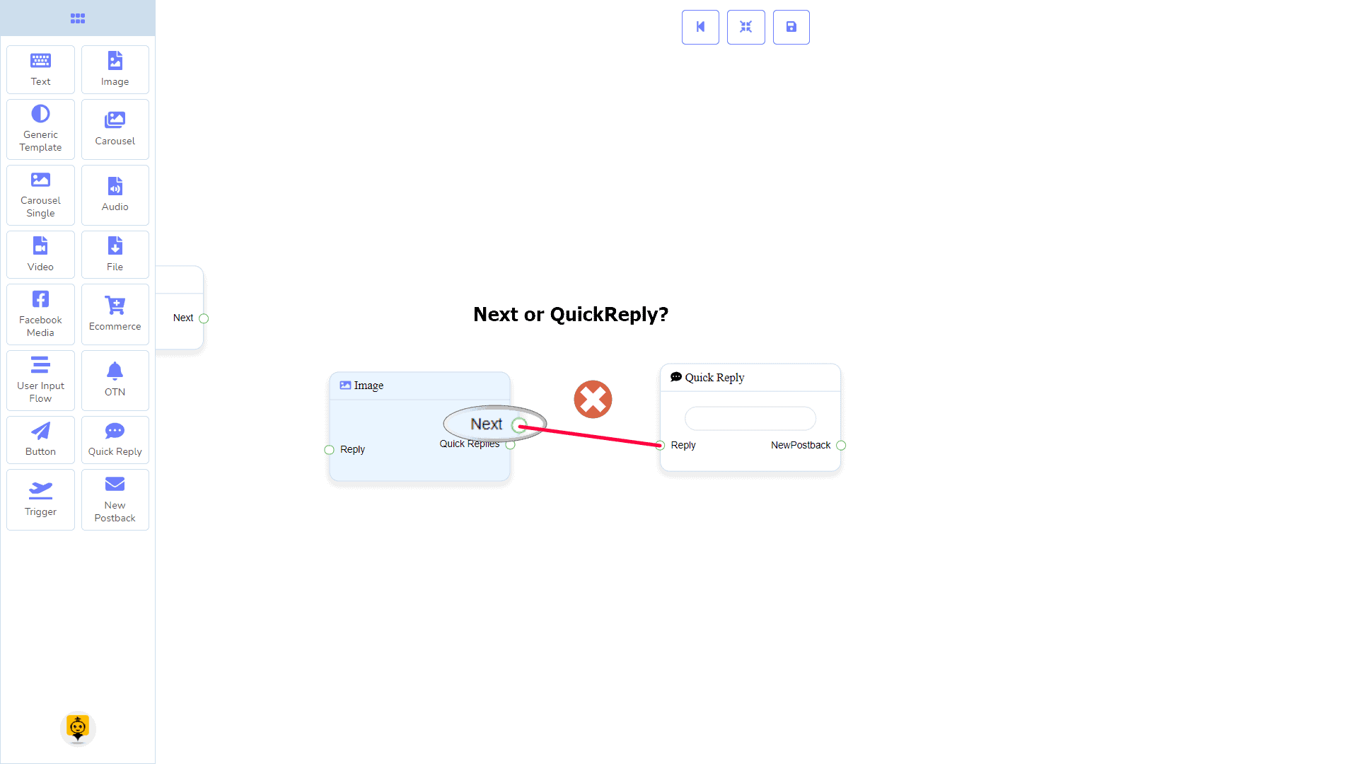
| Note: Next to Quick Replies!? |
| There is a condition between Next and Quick Replies. Using either Next or Quick Replies, you can connect to other components. But you can’t connect to others from both. |
Connections
The Reply may get connection from one of the following components:
- Start Bot Flow, New Postback, Text, Carousel, Facebook Media, Image, Video, Audio, File, Generic Template, Ecommerce, and OTN
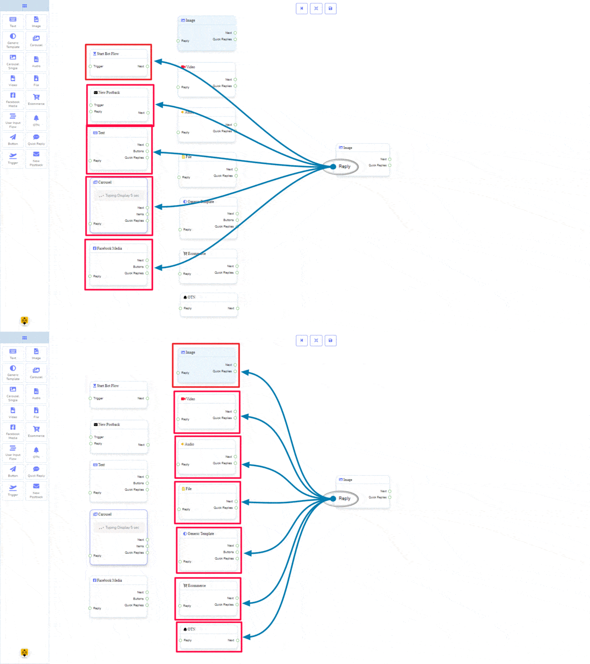
Next may be connected to one of the following components:
- Text, Carousel, Facebook Media, Image, Video, Audio, File, Ecommerce, User Input Flow, Generic Template, and OTN.
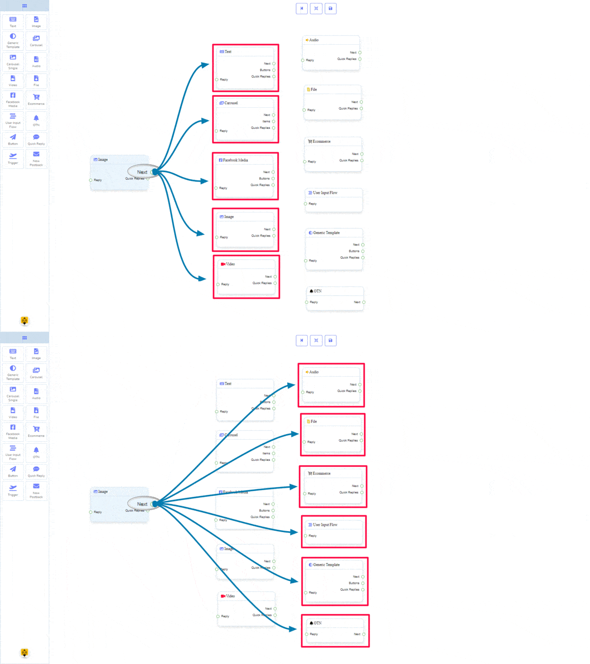
Quick Replies may be connected to the following component:
- Quick Reply
How to create an Image component
Let us see how we can create a reply with an image.
Dragging and Dropping
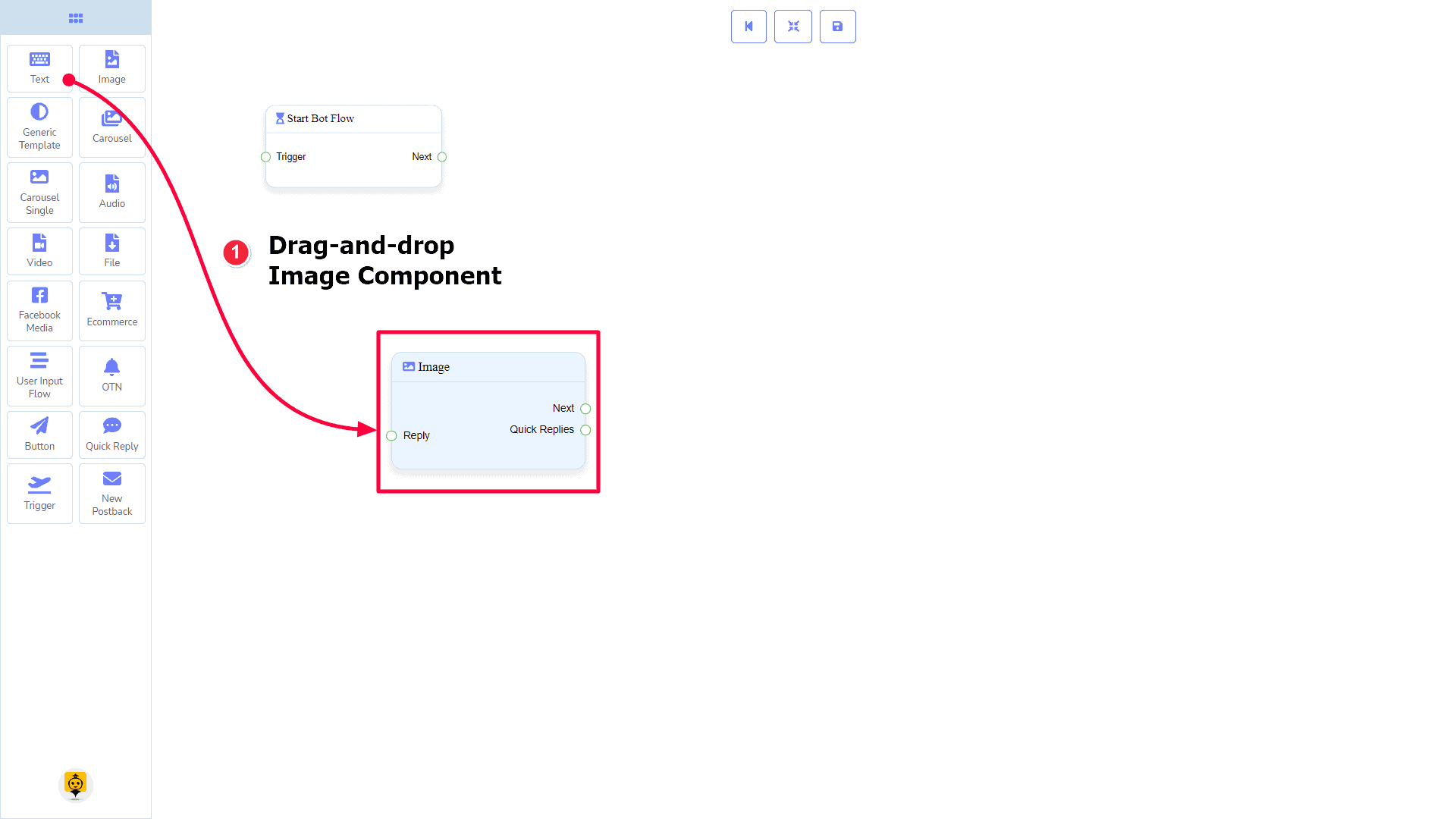
From the dock menu, drag the Image component and drop it on the editor at any place.
Adding Data
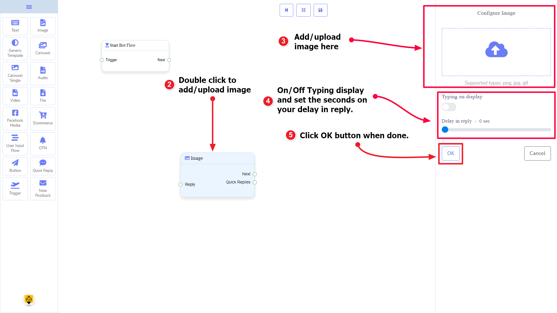
To add data to the Image component, click twice on the body of the Image component. It will open a sidebar on your right. Fill in the fields that you need.
Delay in Reply
If you want to show the typing state on the bot or delay in replying, then you can use those fields.
Generic Template Component
Introduction
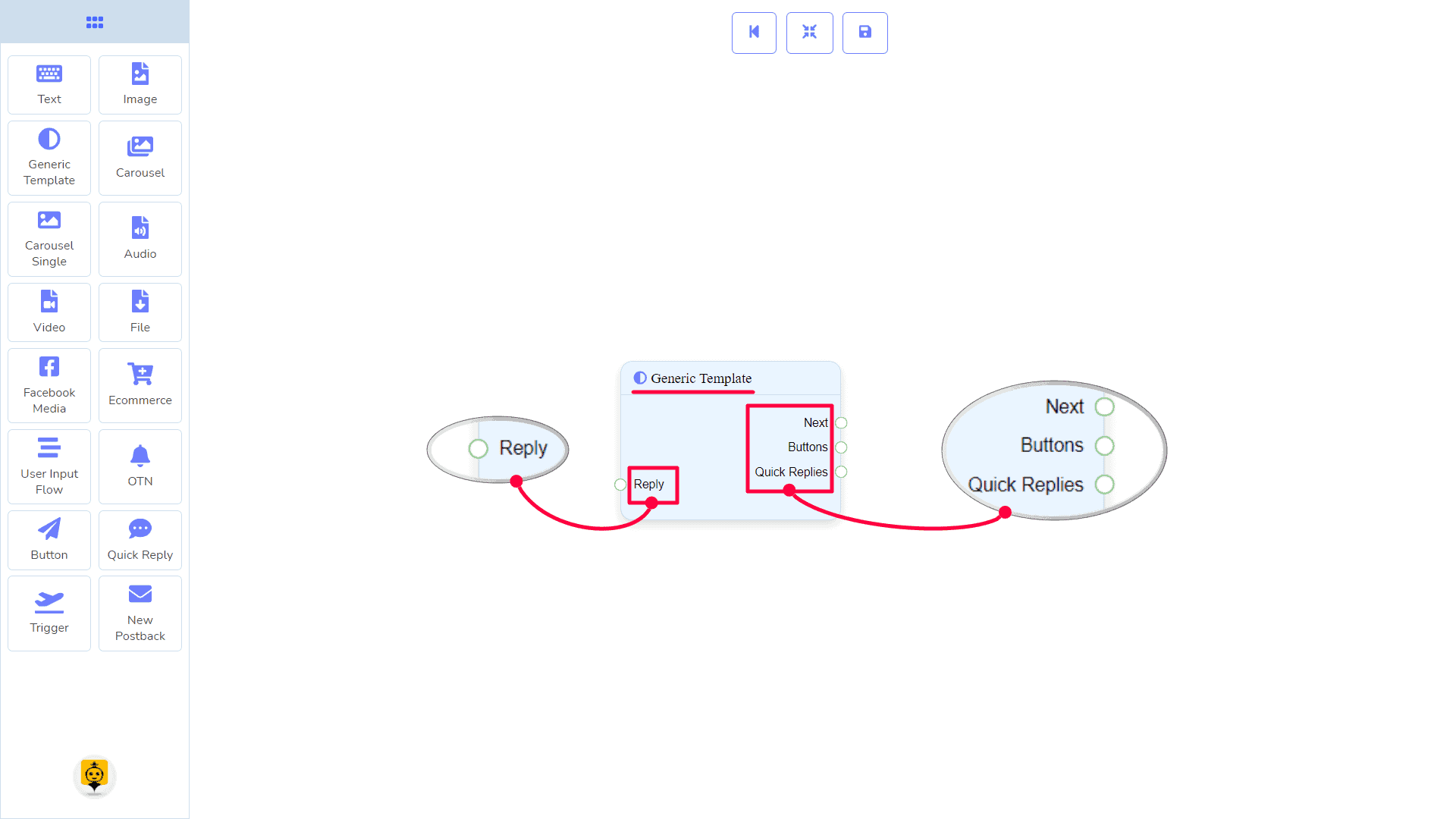
The Generic Template component will allow you to reply with an image, or title and subtitle, or all. It has 1 input socket and 3 output sockets.
- Input: Reply
- Output: Next, Buttons, and Quick Replies
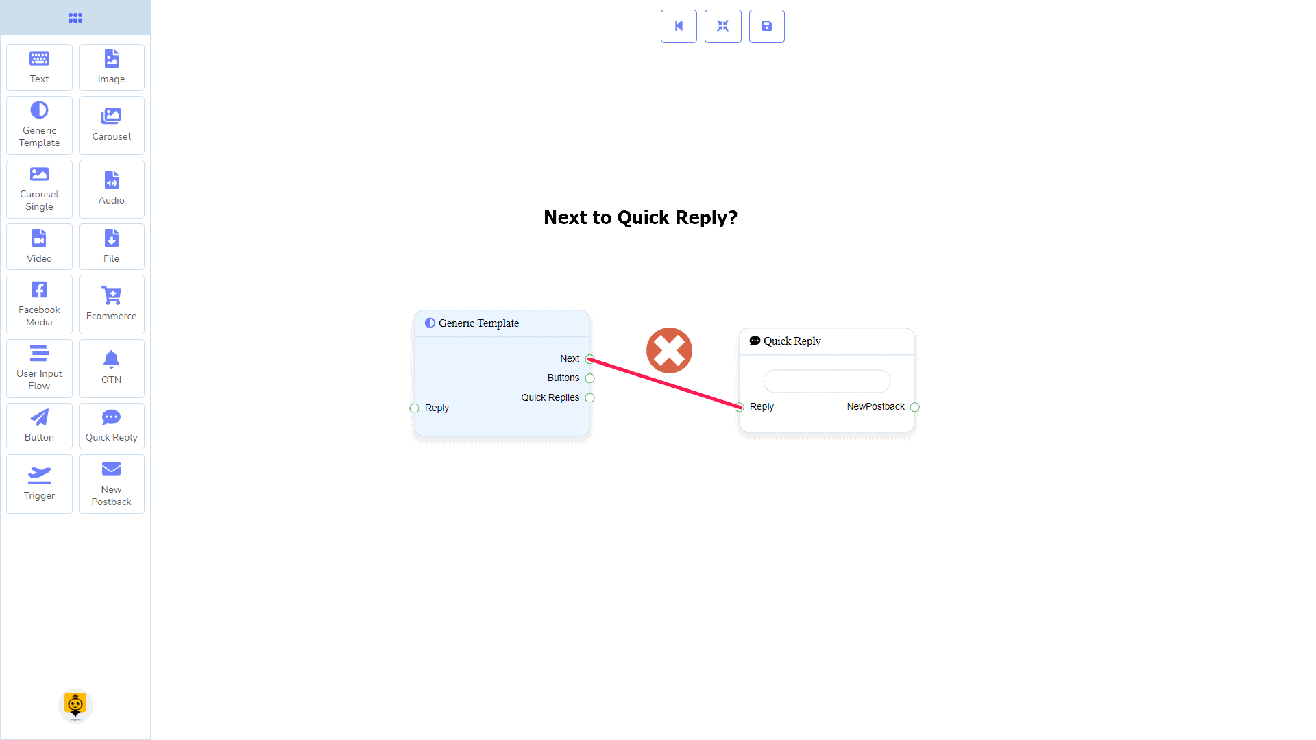
| Note: Next to Quick Replies!? |
| There is a condition between Next and Quick Replies. Using either Next or Quick Replies, you can connect to other components. But you can’t connect to others from both. |
Connections
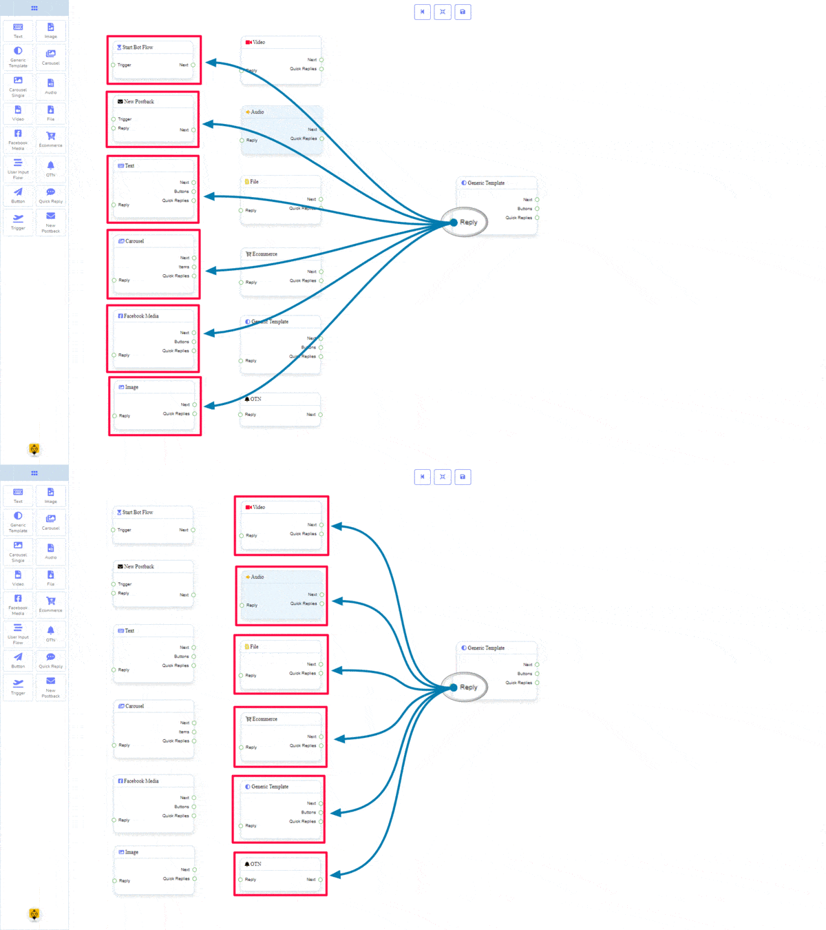
The Reply may get connection from one of the following components:
- Start Bot Flow, New Postback, Text, Carousel, Facebook Media, Image, Video, Audio, File, Ecommerce, Generic Template, and OTN.
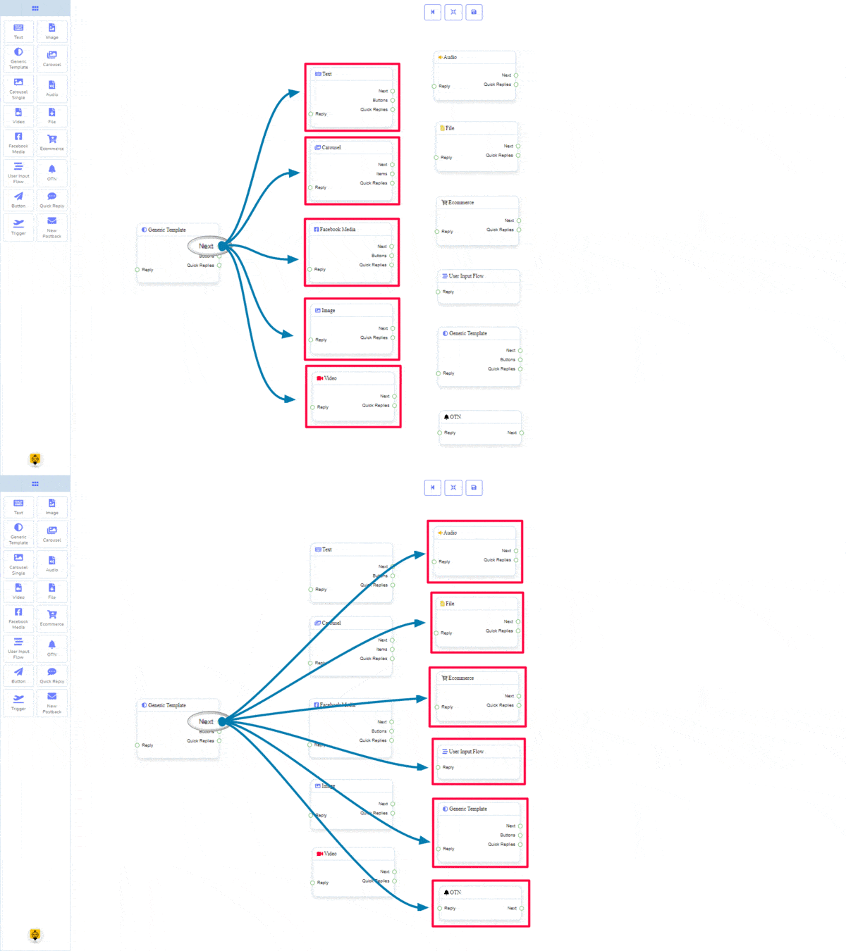
The Next may be connected to one of the following components:
- Text, Carousel, Facebook Media, Image, Video, Audio, File, Ecommerce, User Input Flow, Generic Template, and OTN.
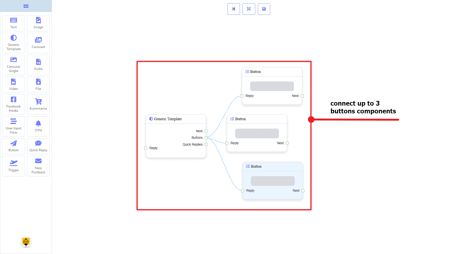
Buttons may be connected to the following component:
- Button – you may connect up to 3 Buttons to the Generic Template component.
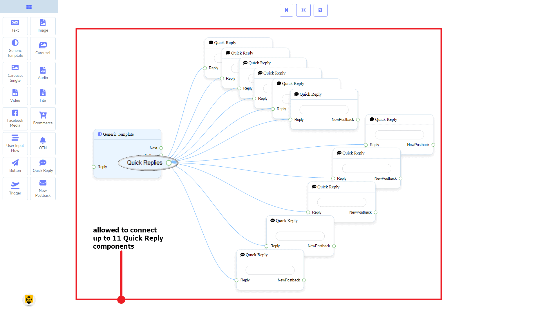
Quick Replies may be connected to the following component:
- Quick Reply – you may connect up to 11 Quick Replies to the Generic Template component.
How to create a General Template component
Let us see how we can create a reply with a generic-template.
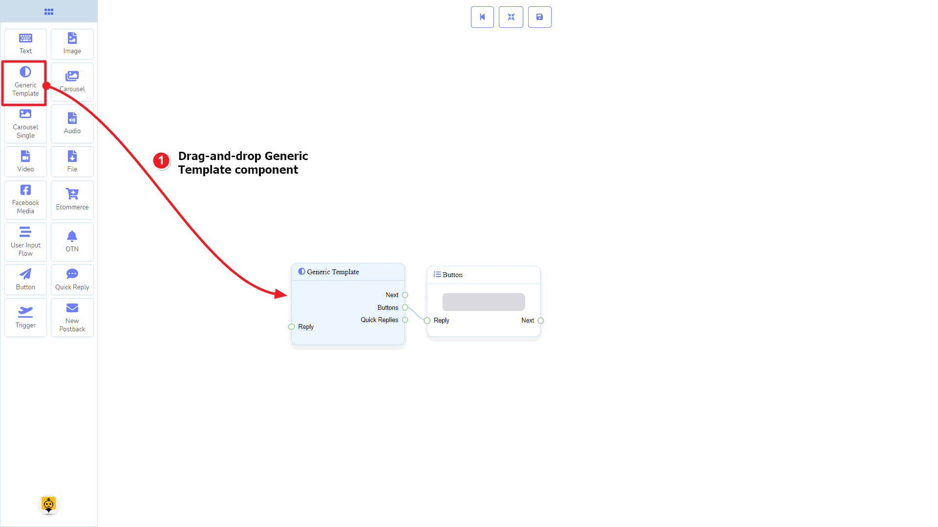
Dragging and Dropping
From the dock menu, drag the Generic Template component and drop it on the editor at any place.
Adding Data
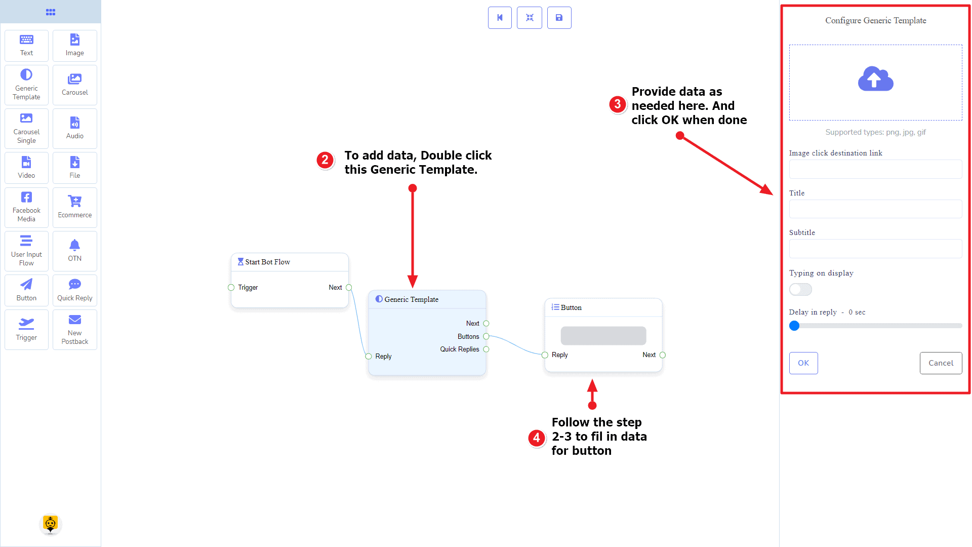
To add data to the Generic Template component, click twice on the body of the Generic Template component. It will open a sidebar on your right. Fill in the fields that you need.
Delay in Reply
If you want to show the typing gif image on the bot or delay in replying, then you can use those fields.
Carousel Component
Introduction
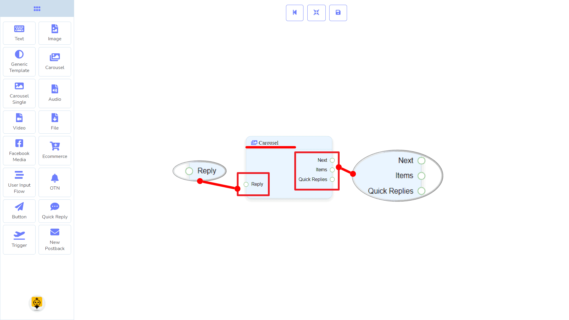
The Carousel component will allow you to reply with a carousel. It has 1 input socket and 3 output sockets.
- Input: Reply
- Output: Next, Items, and Quick Replies
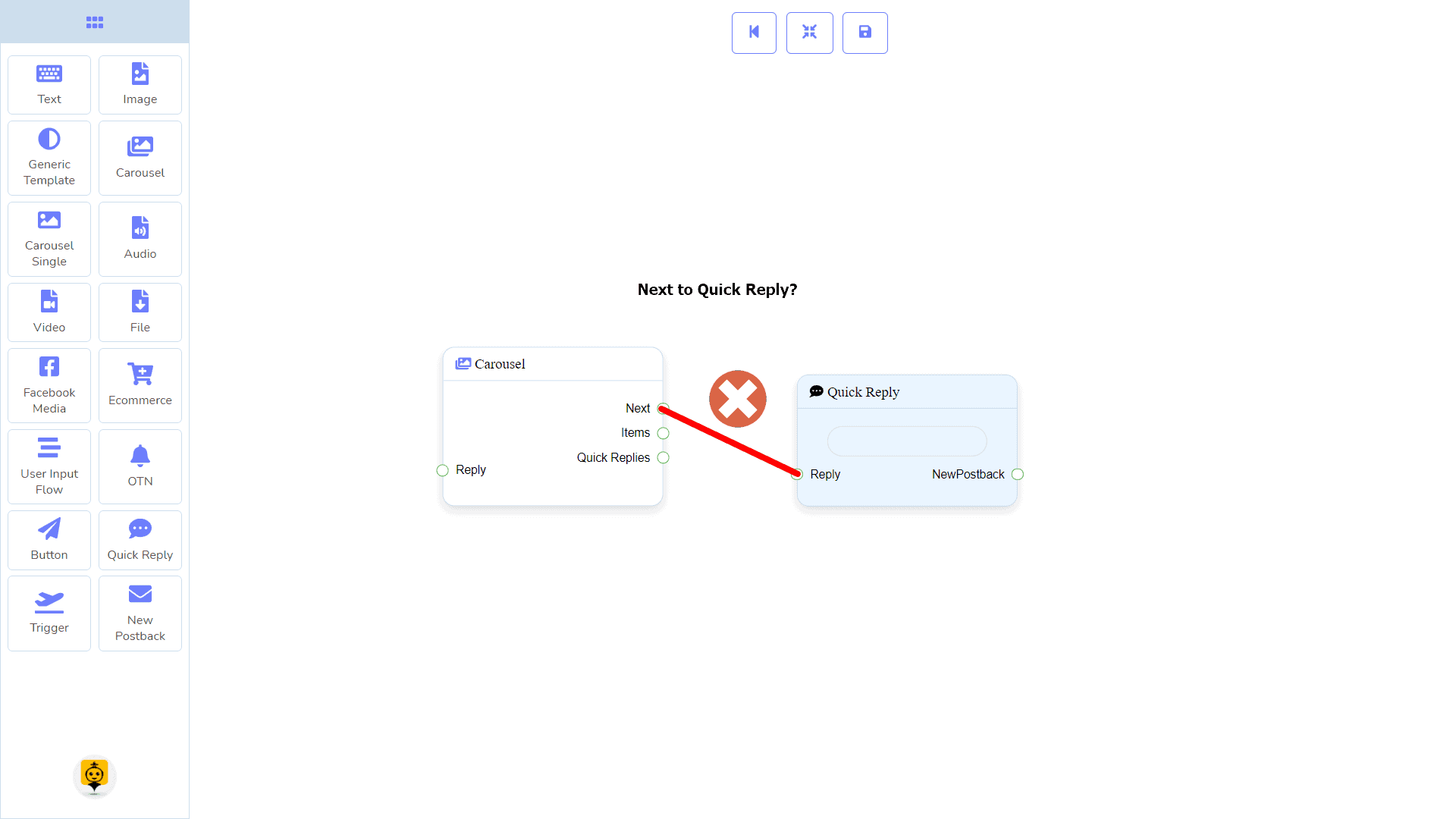
| Note: Next to Quick Replies!? |
| There is a condition between Next and Quick Replies. Using either Next or Quick Replies, you can connect to other components. But you can’t connect to others from both. |
Connections
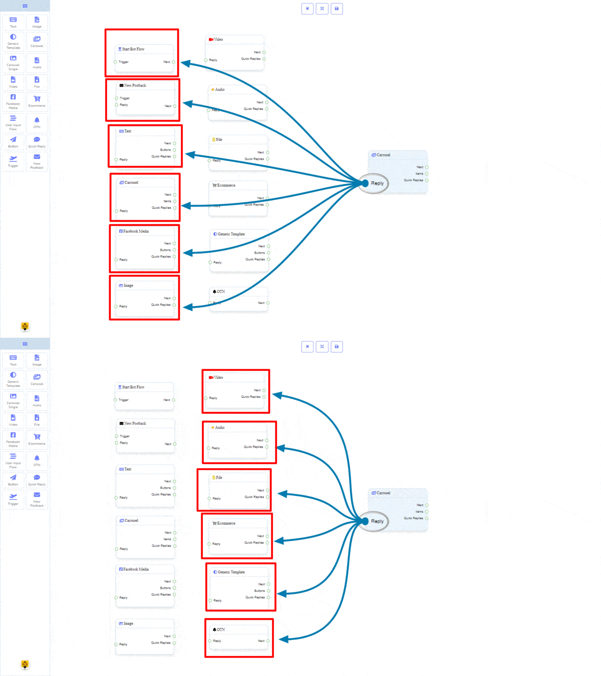
The Reply may get connection from one of the following components:
- Start Bot Flow, New Postback, Text, Carousel, Facebook Media, Image, Video, Audio, File, Ecommerce, Generic Template, and OTN
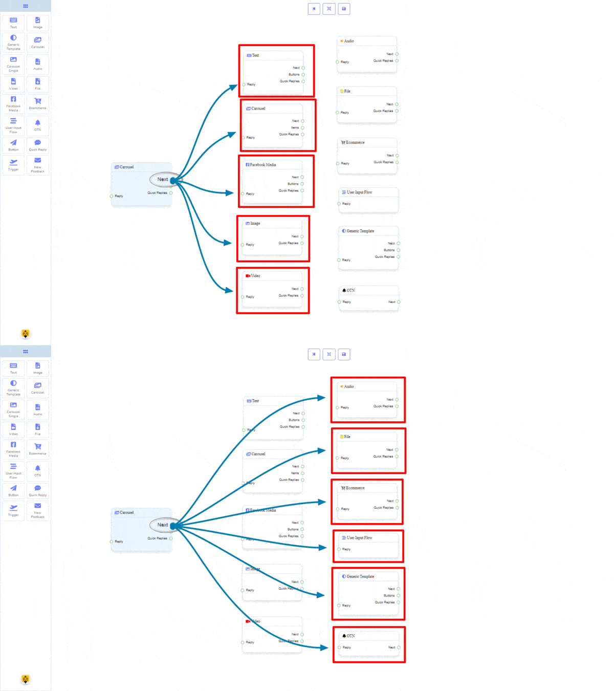
The Next may be connected to one of the following components:
- Text, Carousel, Facebook Media, Image, Video, Audio, File, Ecommerce, User Input Flow, Generic Template, and OTN.
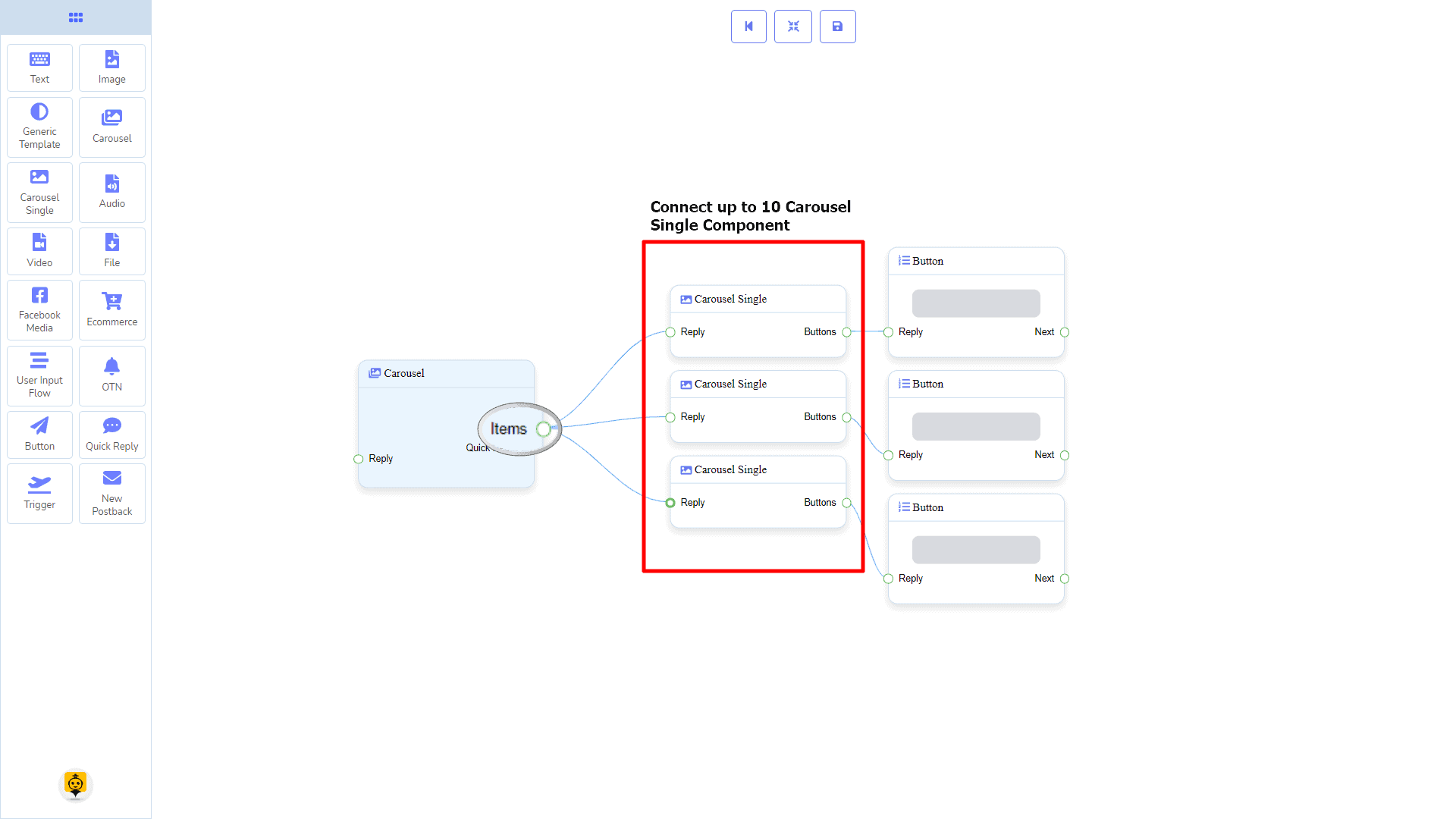
Items may be connected to the following component:
- Carousel Single – you may connect up to 10 Carousel Single components to the Carousel components.
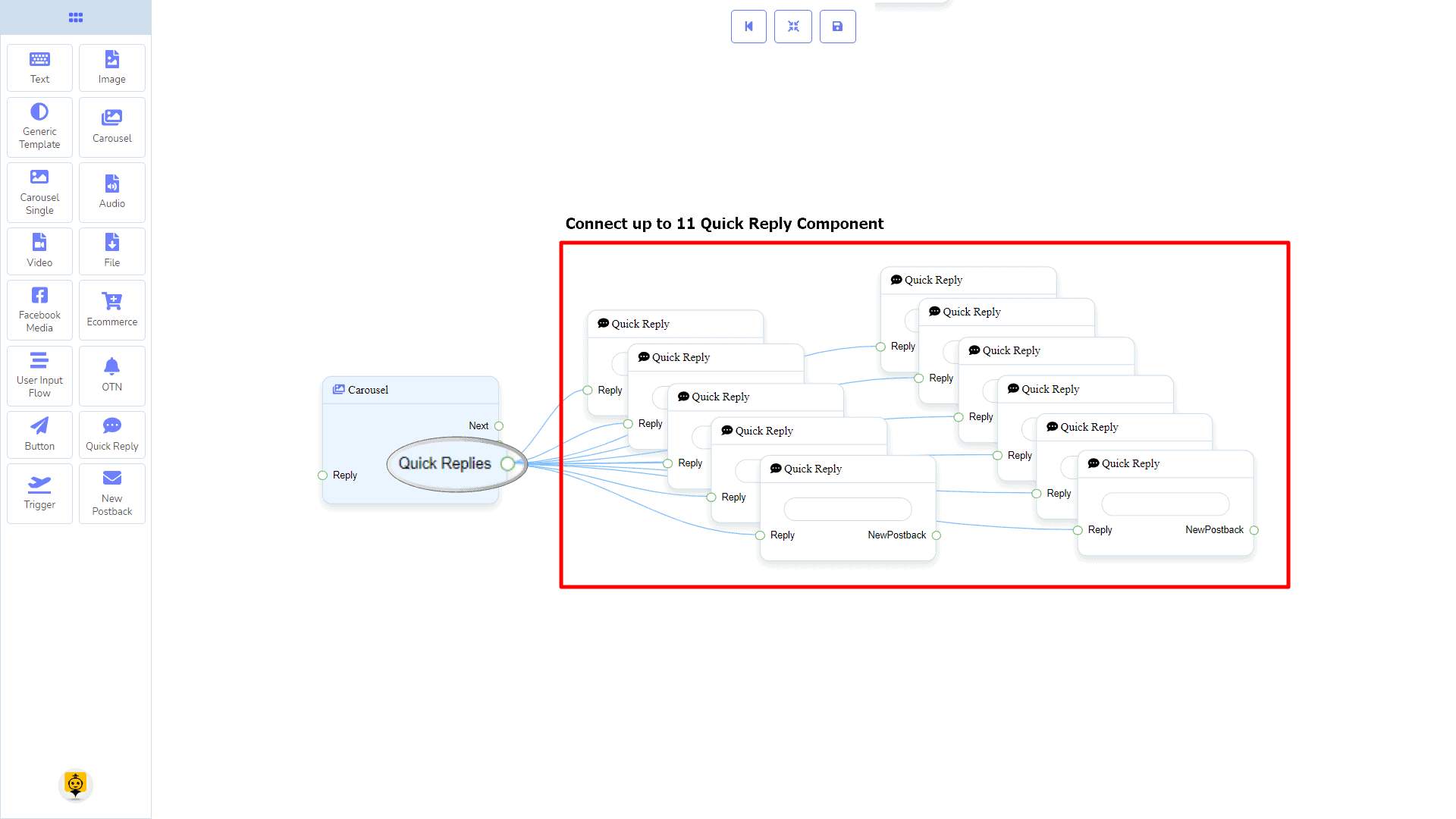
Quick Replies may be connected to the following component:
- Quick Reply – you may connect up to 11 Quick Replies to the Carousel component.
How to create a Carousel component
Let us see how we can create a reply with carousel
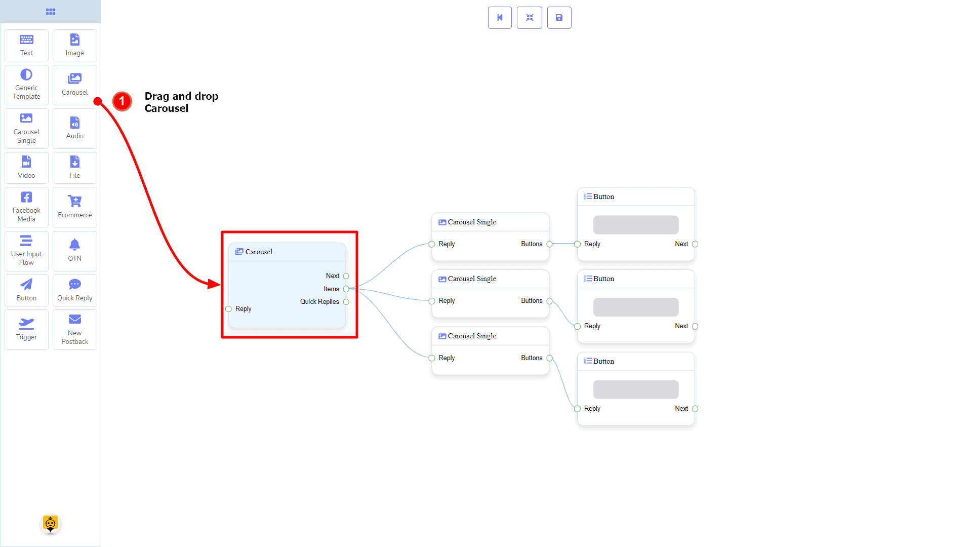
Dragging and Dropping
From the dock menu, drag the Carousel component and drop it on the editor at any place. Next, you see 3 Carousel Single components and 3 Button components have been created with the Carousel component.
Adding Data
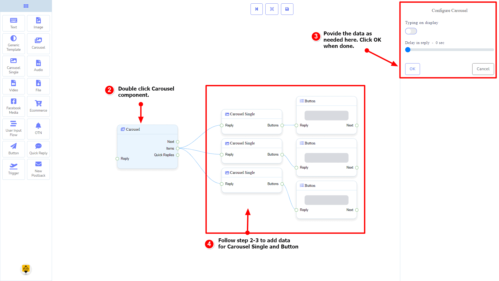
To add data to the Carousel component, click twice on the body of the Carousel component. It will open a sidebar on your right with only fields asking reply-delay and type-state. Interact with them if you need.
By default, we provided 3 carousel single items. You can add more if you wish. Now it’s time to prepare a carousel single component. Make double-click on each of them to provide data as you need.
Having done with filling in carousel single, you may go for button component to be provided with your carousel. Make double-click on the button component to fill in data as you need.
Carousel Single Component
Introduction
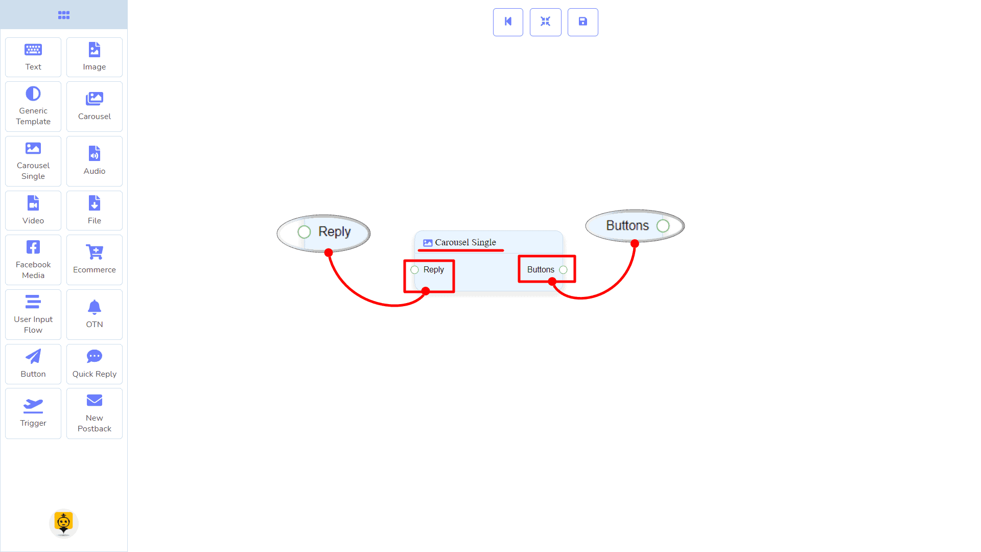
Carousel Single component will allow you to reply with an image, or title and subtitle, or all. It has 1 input socket and 1 output socket.
- Input: Reply
- Output: Button
Connections
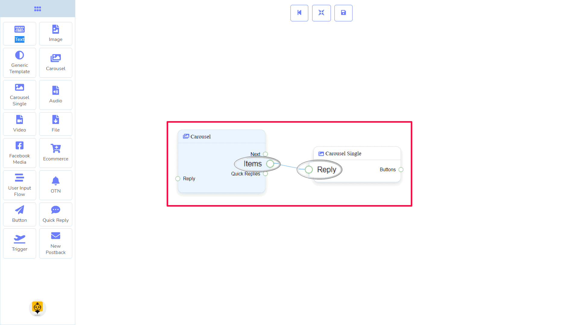
The Reply may get connection from the following component:
- Carousel
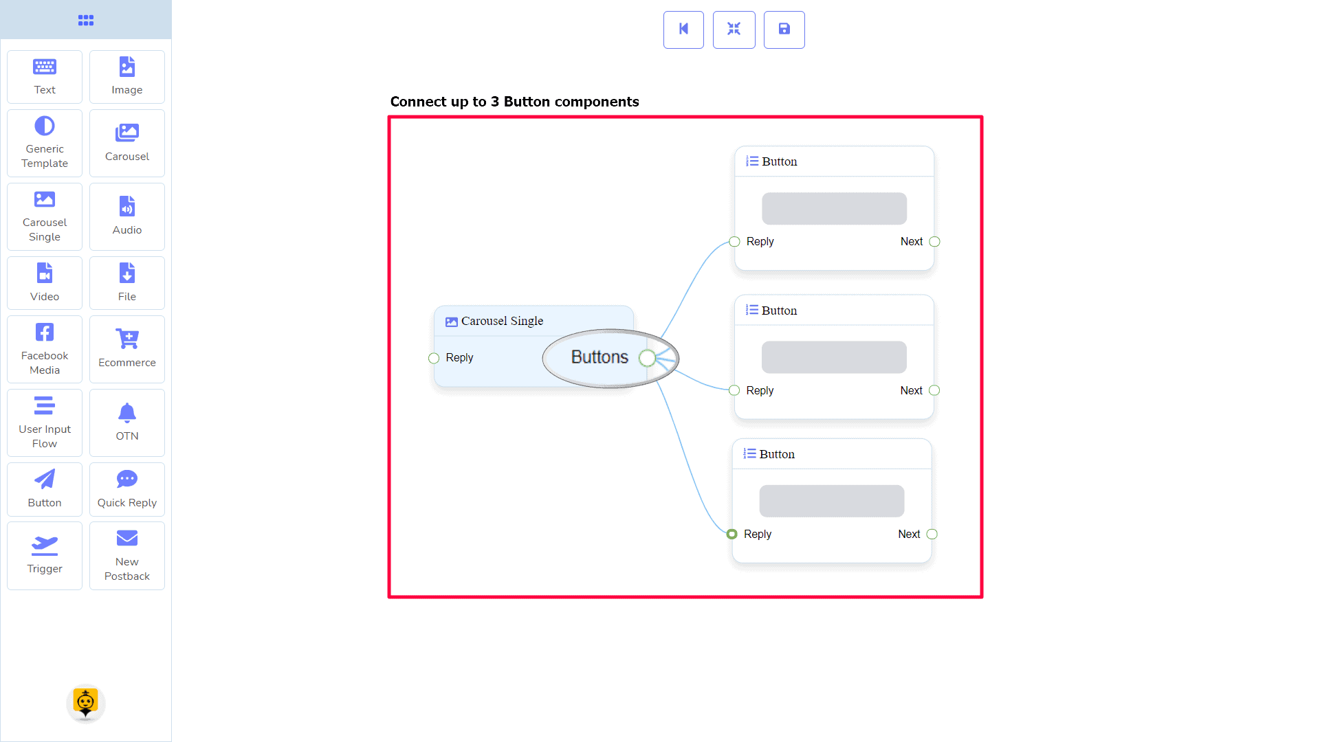
The Button may be connected to the following component:
- Button – you may connect up to 3 Button components to the Carousel Single component.
How to create a Carousel Single component
Carousel Single is dependent on the Carousel component. So we make it prepare to be connected to the Carousel component.
Dragging and Dropping
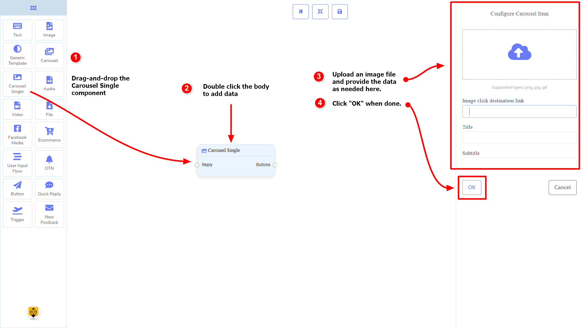
From the dock menu, drag the Carousel Single component and drop it on the editor at any place.
Adding Data
To add data to the Carousel Single component, click twice on the body of the Carousel Single component. It will open a sidebar on your right. Fill in the fields as you need.
Delay in Reply
If you want to show the typing gif image on the bot or delay in replying, then you can use those fields.
Audio Component
Introduction
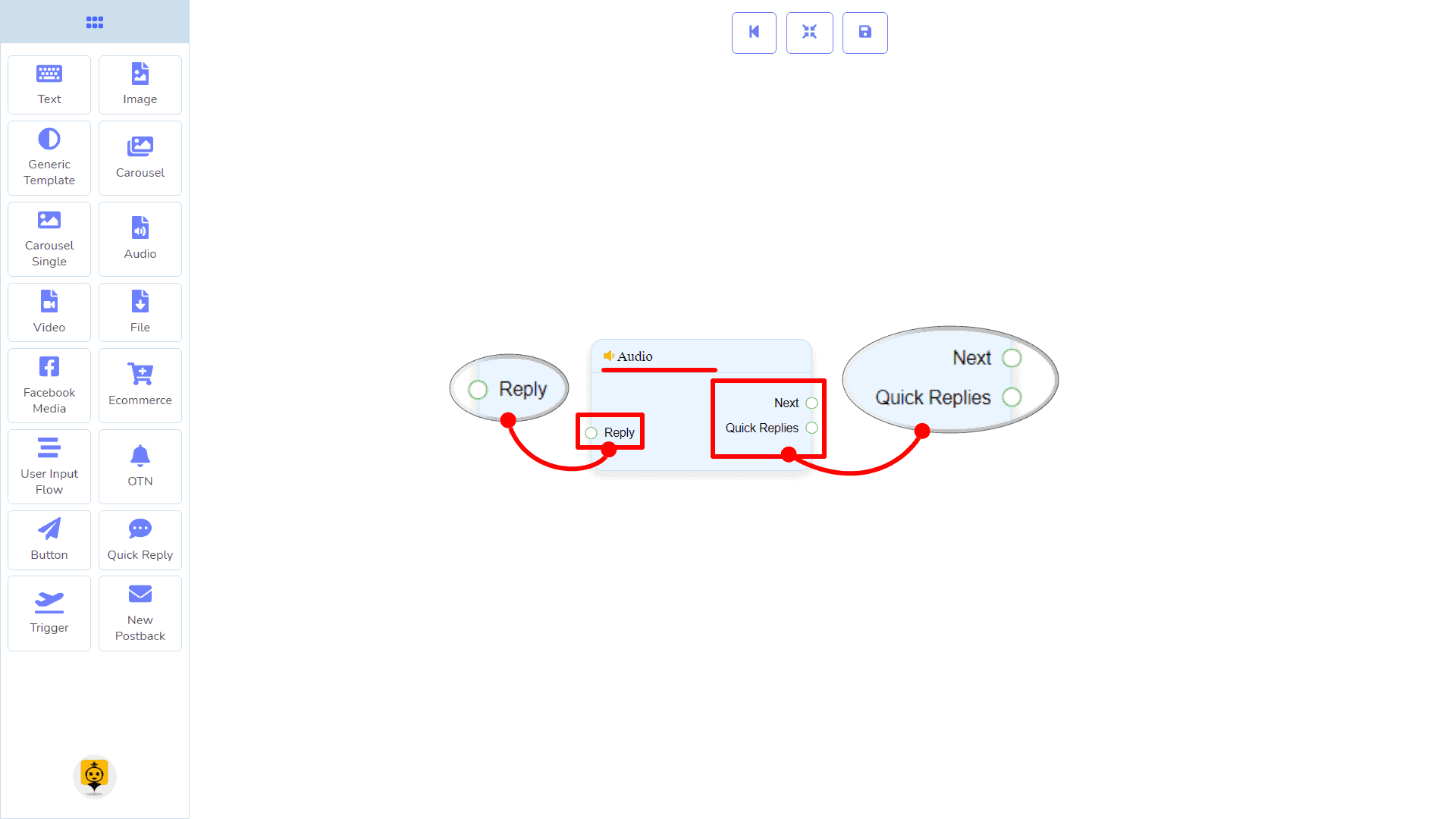
The Audio component will allow you to reply with an audio file. It has 1 input socket and 2 output sockets.
- Input: Reply
- Output: Next, and Quick Replies
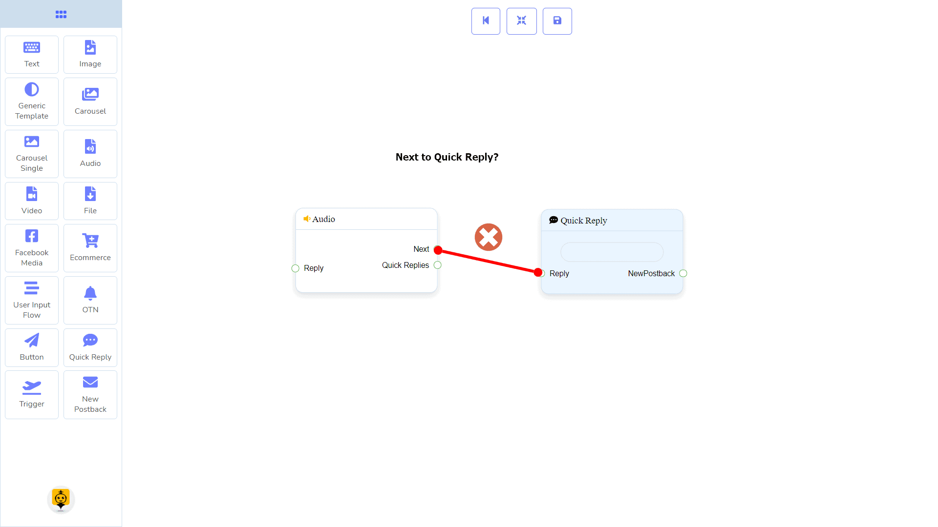
| Note: Next to Quick Replies!? |
| There is a condition between Next and Quick Replies. Using either Next or Quick Replies, you can connect to other components. But you can’t connect to others from both. |
Connections
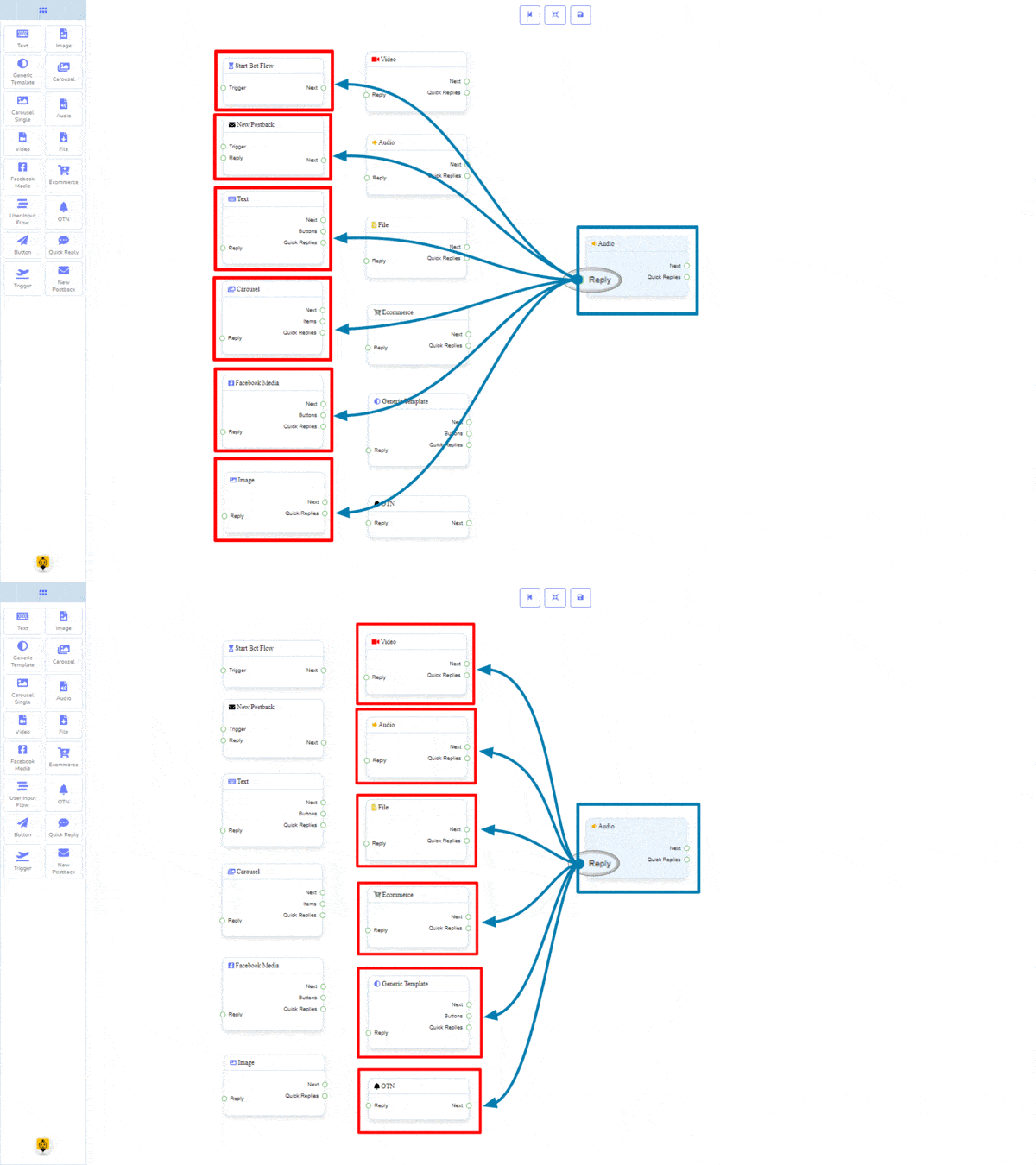
The Reply may get connection from one of the following components:
- Start Bot Flow, New Postback, Text, Carousel, Facebook Media, Image, Video, Audio, File, Ecommerce, Generic Template, and OTN.
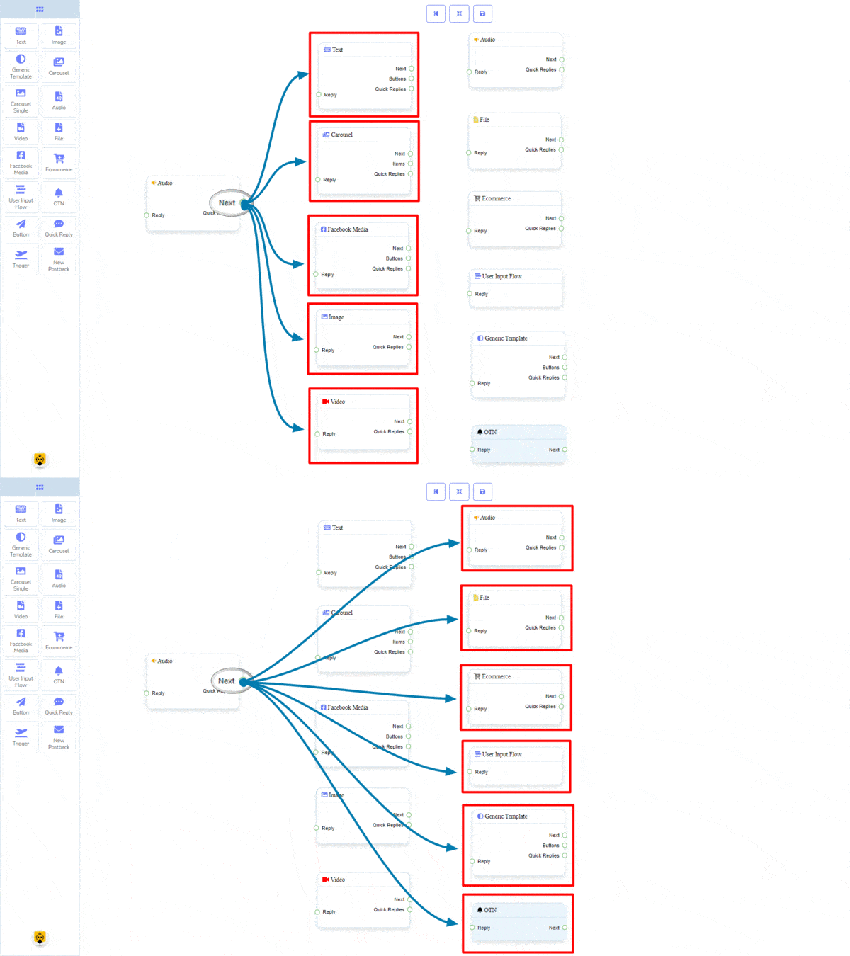
Next may be connected to one of the following components:
- Text, Carousel, Facebook Media, Image, Video, Audio, File, Ecommerce, User Input Flow, Generic Template, and OTN.
Quick Replies may be connected to the following component:
- Quick Reply – you may connect up to 11 Quick Replies to the Audio component.

How to create an Audio component
Let us see how we can create a reply with an audio component.
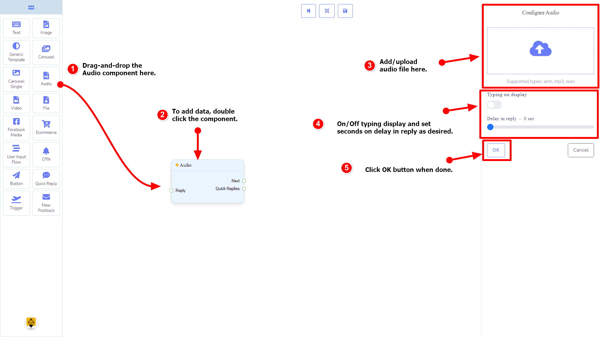
Dragging and Dropping
From the dock menu, drag the Audio component and drop it on the editor at any place.
Adding Data
To add data to the Audio component, click twice on the body of the Audio component. It will open a sidebar on your right. Fill in the fields that you need.
Delay in Reply
If you want to show the typing state on the bot or delay in replying, then you can use those fields.
Video Component
Introduction
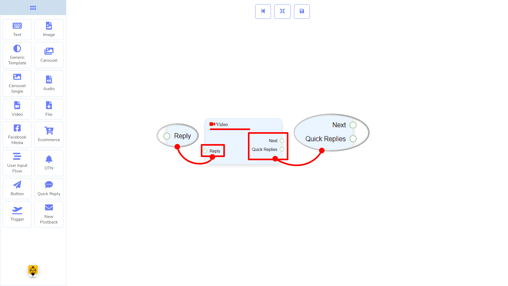
The Video component will allow you to reply with a video file. It has 1 input socket and 2 output sockets.
- Input: Reply
- Output: Next, and Quick Replies
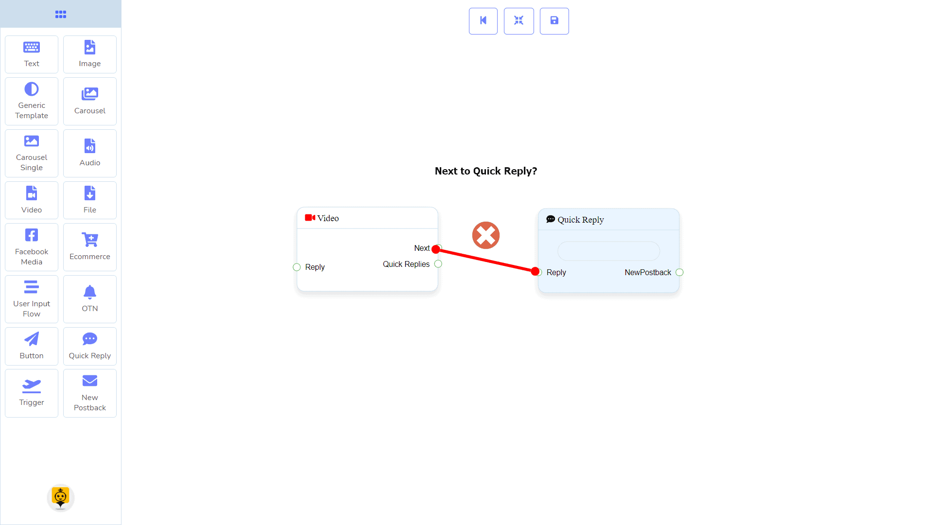
| Note: Next to Quick Replies!? |
| There is a condition between Next and Quick Replies. Using either Next or Quick Replies, you can connect to other components. But you can’t connect to others from both. |
Connections
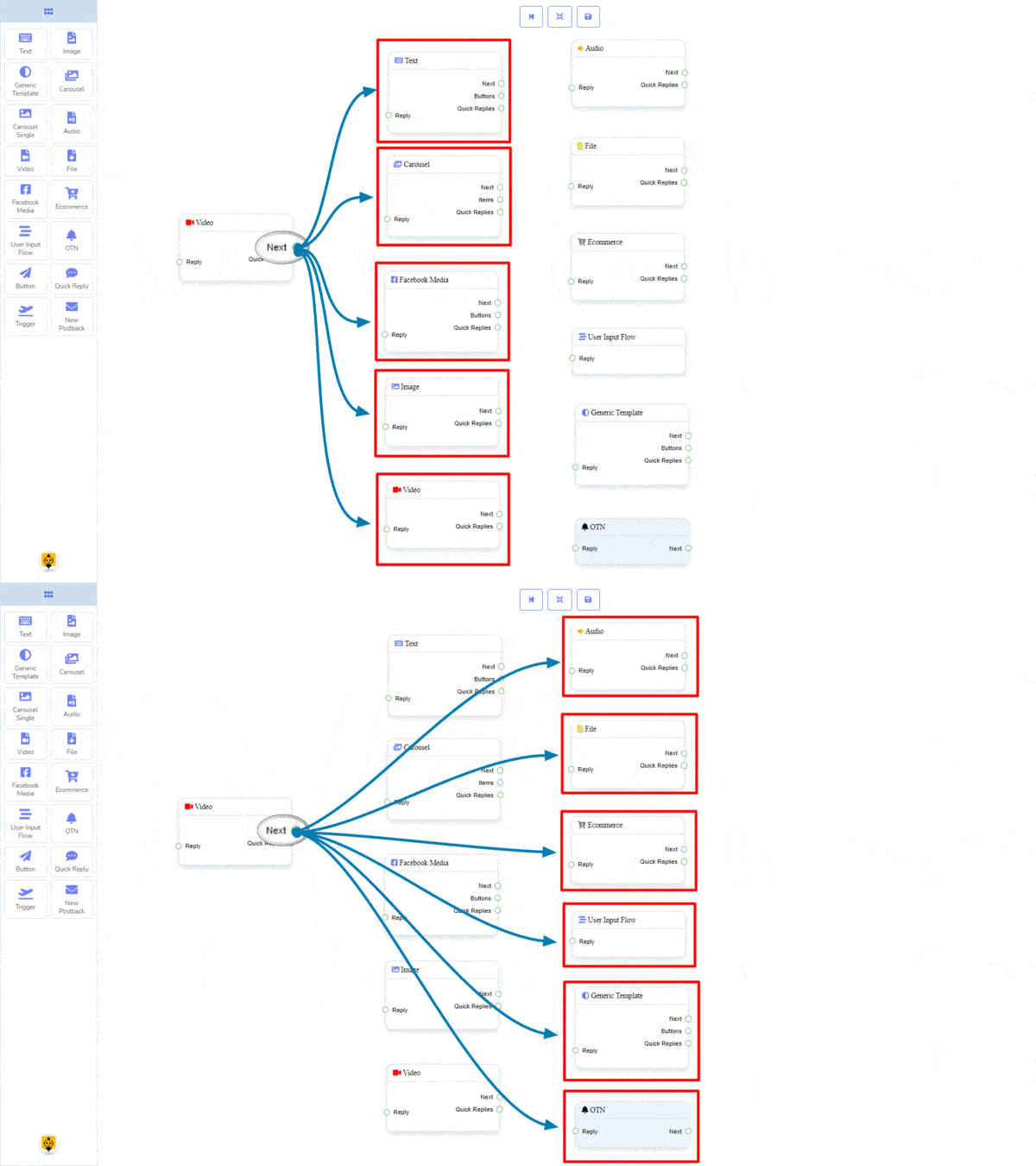
The Reply may get connection from one of the following components:
- Start Bot Flow, New Postback, Text, Carousel, Facebook Media, Image, Video, Audio, File, Ecommerce, Generic Template, and OTN.

Next may be connected to one of the following components:
- Text, Carousel, Facebook Media, Image, Video, Audio, File, Ecommerce, User Input Flow, Generic Template, and OTN.
Quick Replies may be connected to the following component:
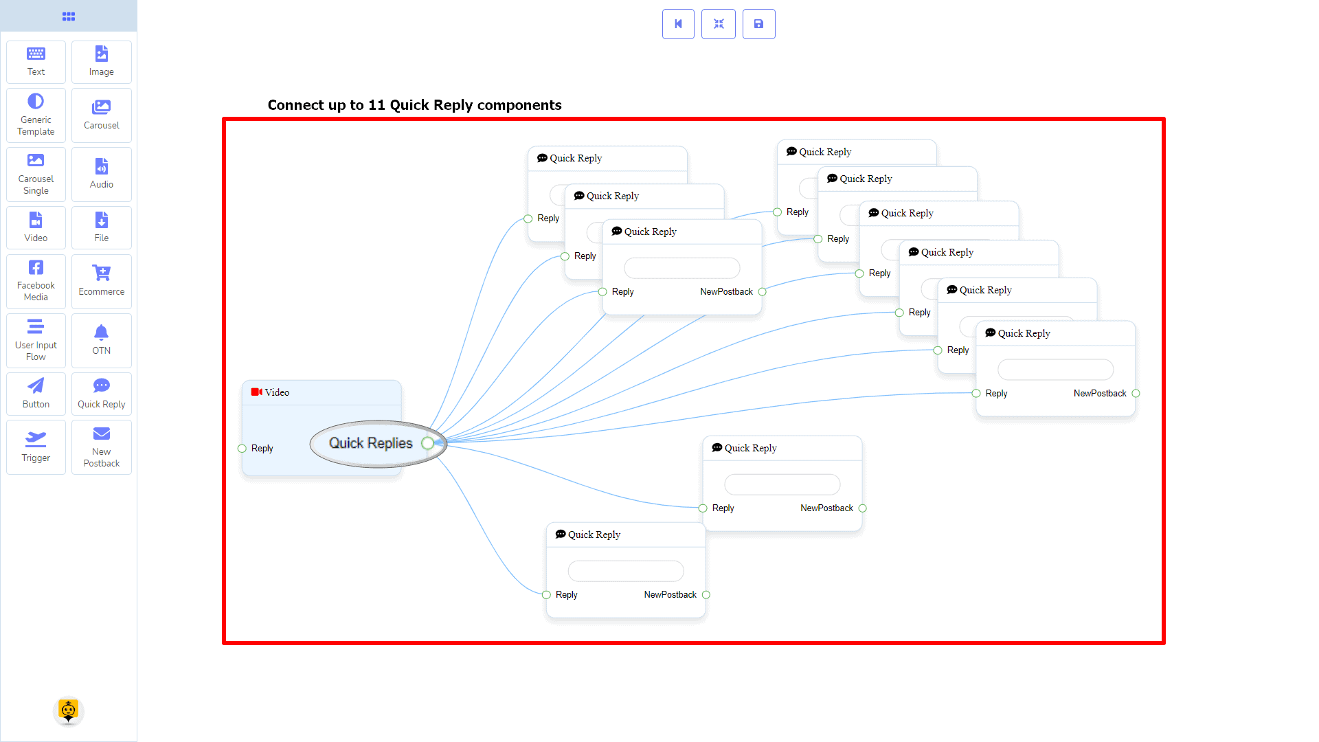
- Quick Reply – you may connect up to 11 Quick Replies to the Video component.
How to create a Video component
Let us see how we can create a reply with a video component.
Dragging and Dropping
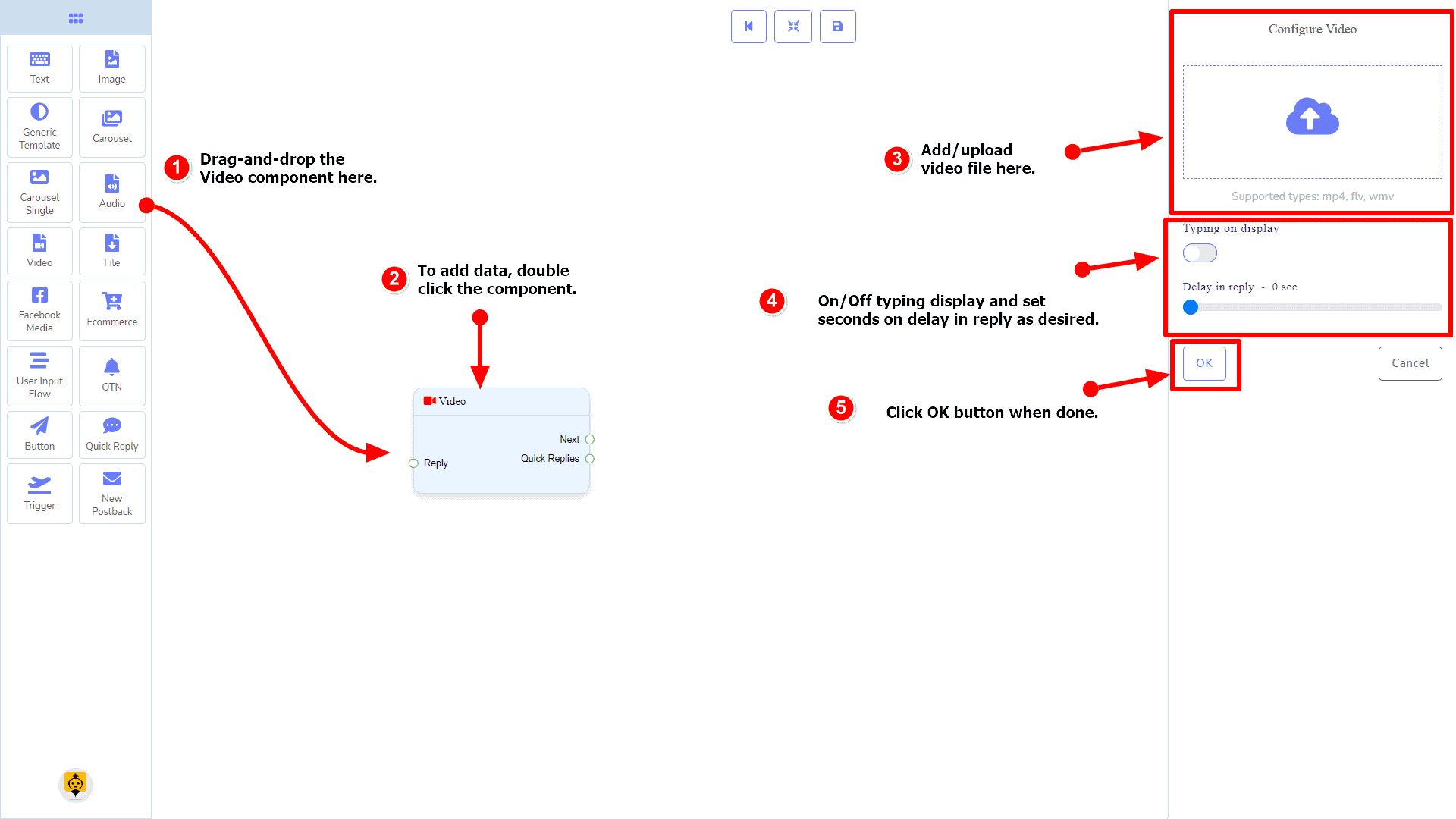
From the dock menu, drag the Video component and drop it on the editor at any place.
Adding Data
To add data to the Video component, click twice on the body of the Video component. It will open a sidebar on your right. Fill in the fields that you need.
Delay in Reply
If you want to show the typing state on the bot or delay in replying, then you can use those fields.
File Component
Introduction
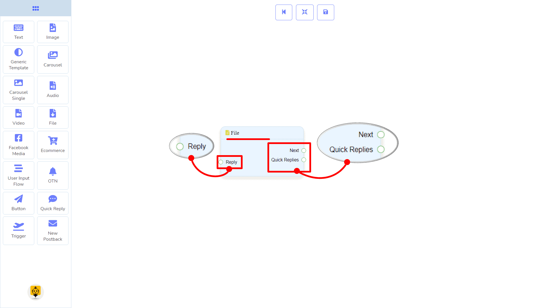
The File component will allow you to reply with a file. It has 1 input socket and 2 output sockets.
- Input: Reply
- Output: Next, and Quick Replies
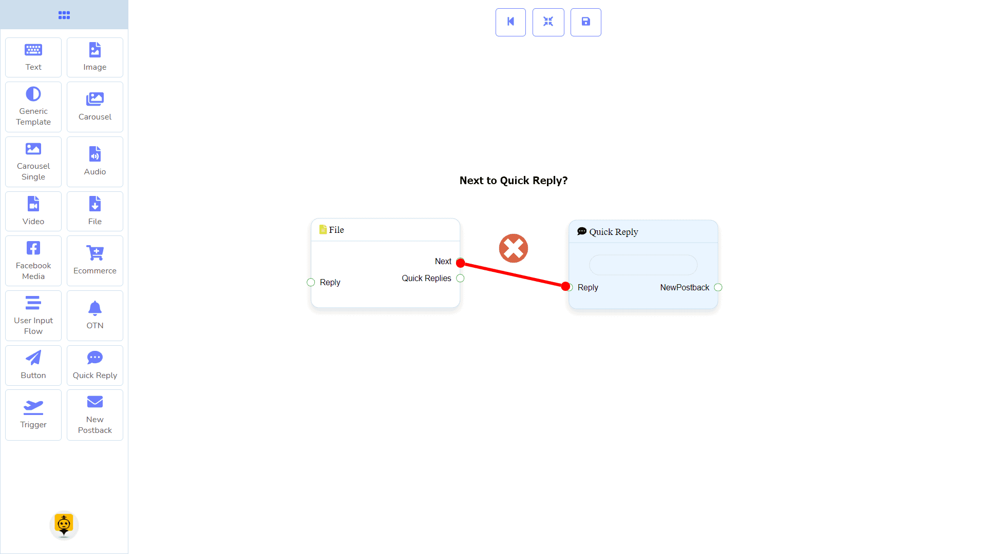
| Note: Next to Quick Replies!? |
| There is a condition between Next and Quick Replies. Using either Next or Quick Replies, you can connect to other components. But you can’t connect to others from both. |
Connections
The Reply may get connection from one of the following components:
- Start Bot Flow, New Postback, Text, Carousel, Facebook Media, Image, Video, Audio, File, Ecommerce, Generic Template, and OTN.

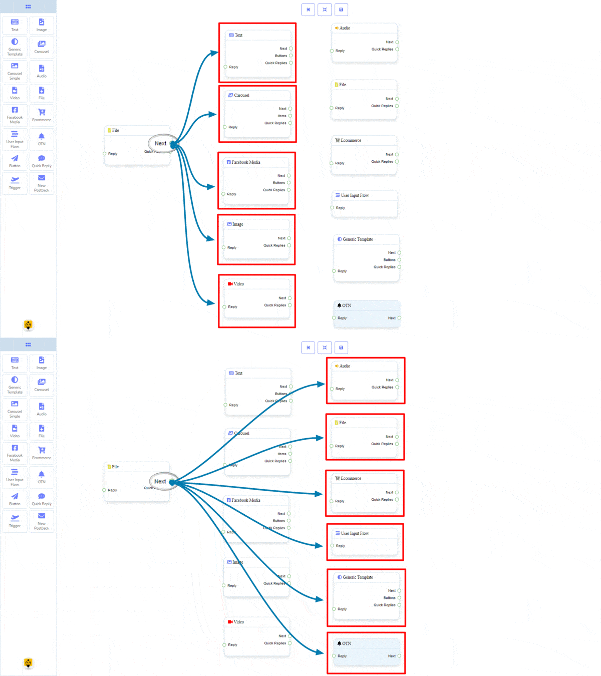
Next may be connected to one of the following components:
- Text, Carousel, Facebook Media, Image, Video, Audio, File, Ecommerce, User Input Flow, Generic Template, and OTN.
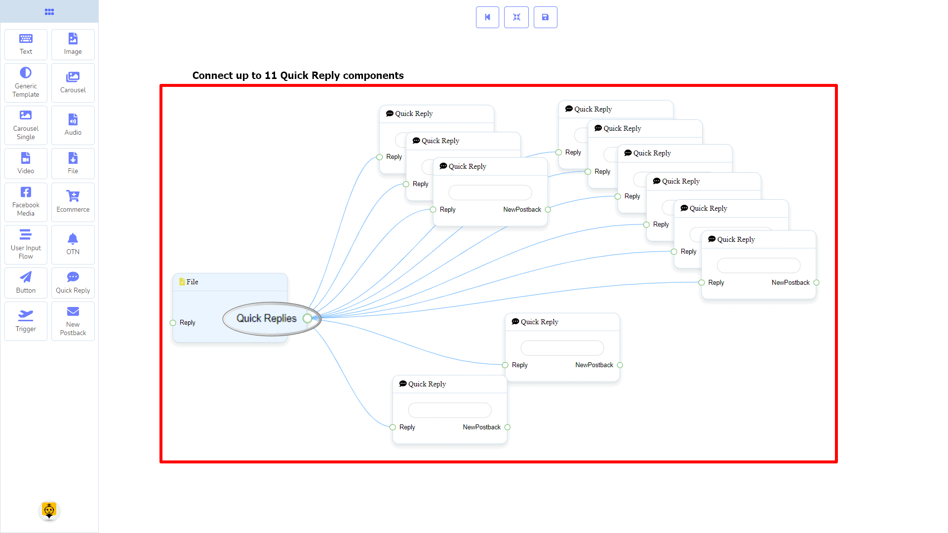
Quick Replies may be connected to the following component:
- Quick Reply – you may connect up to 11 Quick Replies to the File component.
How to create a File component
Let us see how we can create a reply with a file component.
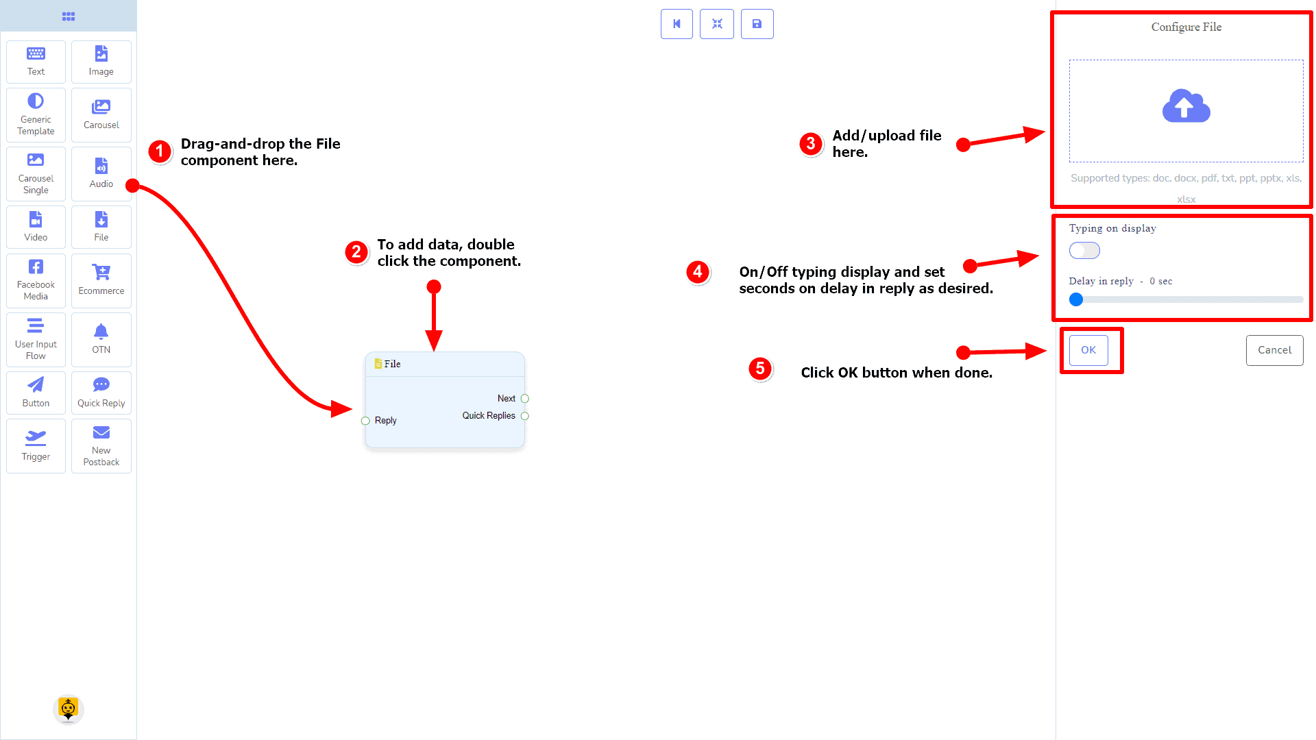
Dragging and Dropping
From the dock menu, drag the File component and drop it on the editor at any place.
Adding Data
To add data to the File component, click twice on the body of the File component. It will open a sidebar on your right. Fill in the fields that you need.
Delay in Reply
If you want to show the typing state on the bot or delay in replying, then you can use those fields.
Facebook Media Component
Introduction
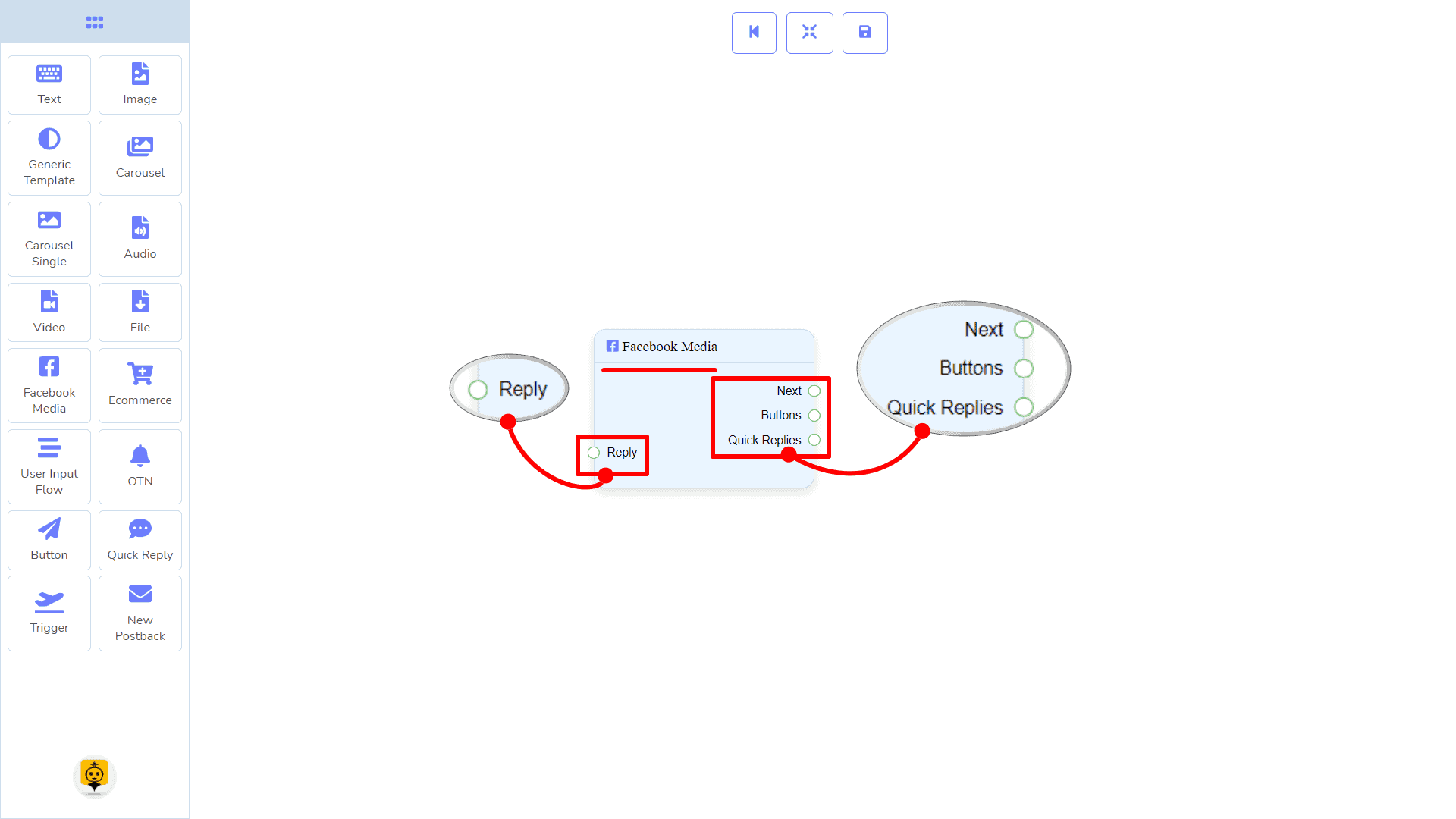
Facebook Media component will allow you to reply by referring to a Facebook page. It has 1 input socket and 3 output sockets.
- Input: Reply
- Output: Next, Buttons, and Quick Replies
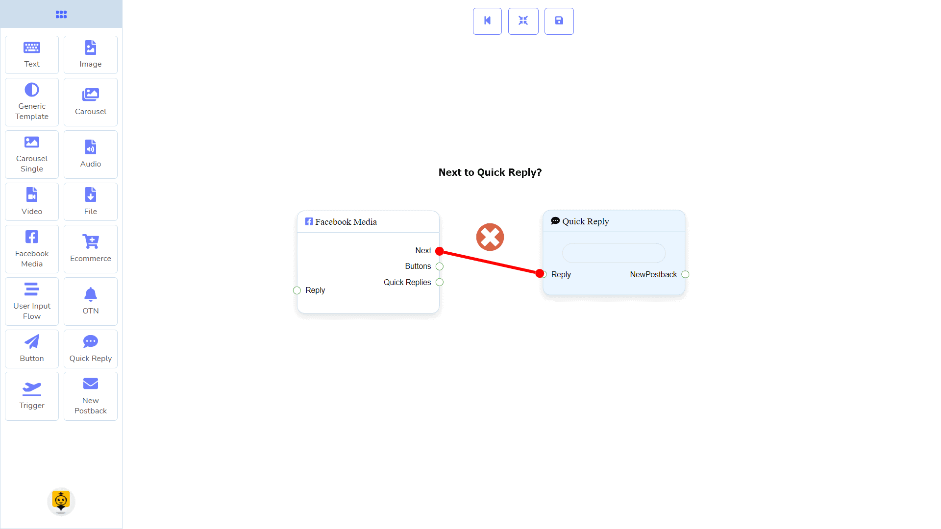
| Note: Next to Quick Replies!? |
| There is a condition between Next and Quick Replies. Using either Next or Quick Replies, you can connect to other components. But you can’t connect to others from both. |
Connections
The Reply may get connection from one of the following components:
- Start Bot Flow, New Postback, Text, Carousel, Facebook Media, Image, Video, Audio, File, Ecommerce, Generic Template, and OTN.
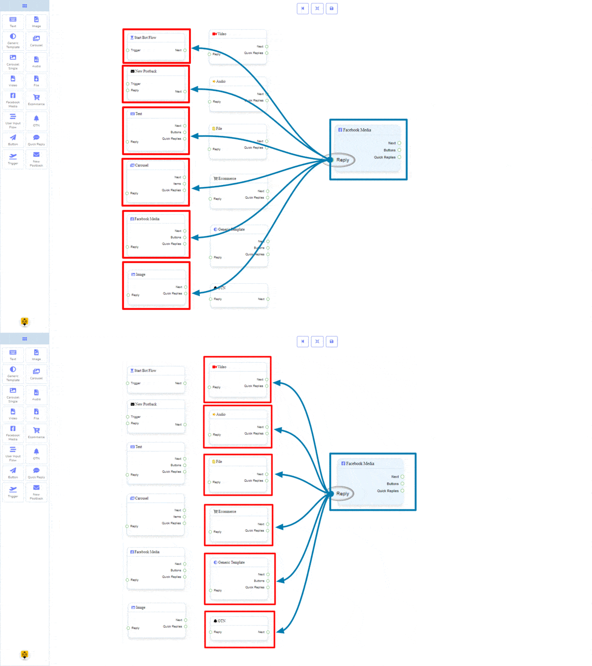
Next may be connected to one of the following components:
- Text, Carousel, Facebook Media, Image, Video, Audio, File, Ecommerce, User Input Flow, Generic Template, and OTN.

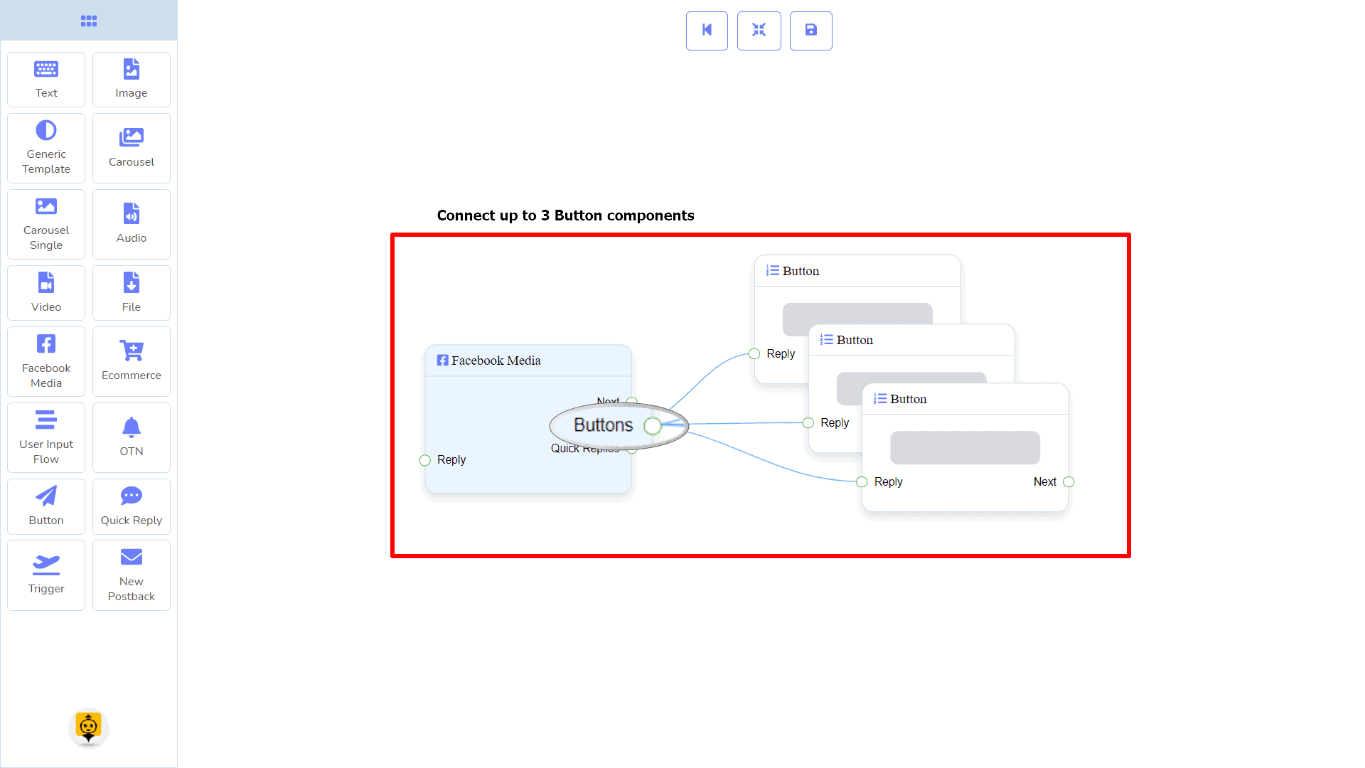
Buttons may be connected to the following component:
- Button – you may connect up to 3 Button components to the Facebook Media component.
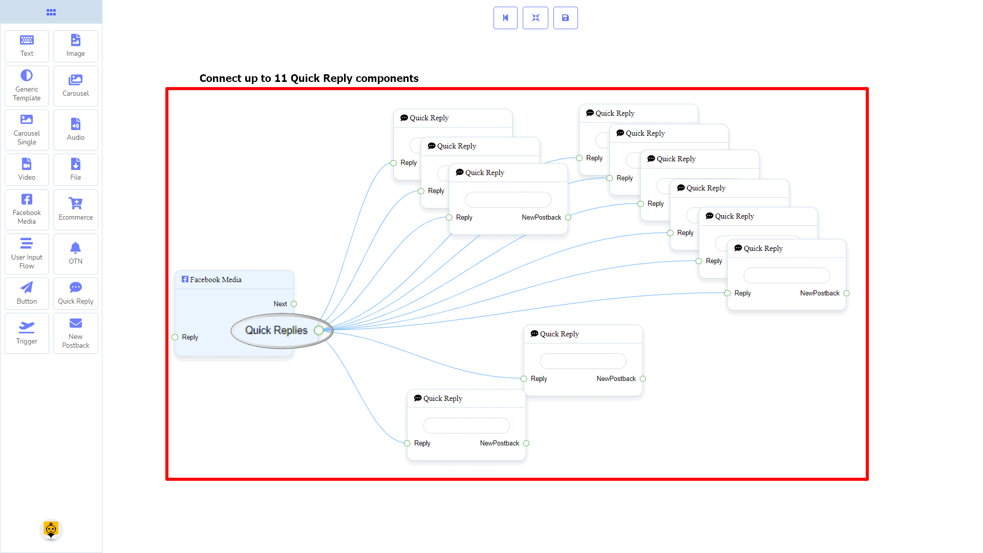
Quick Replies may be connected to the following component:
- Quick Reply – you may connect up to 11 Quick Replies to the Facebook Media component.
How to create a Facebook Media component
Let us see how we can create a reply with a Facebook page.
Dragging and Dropping
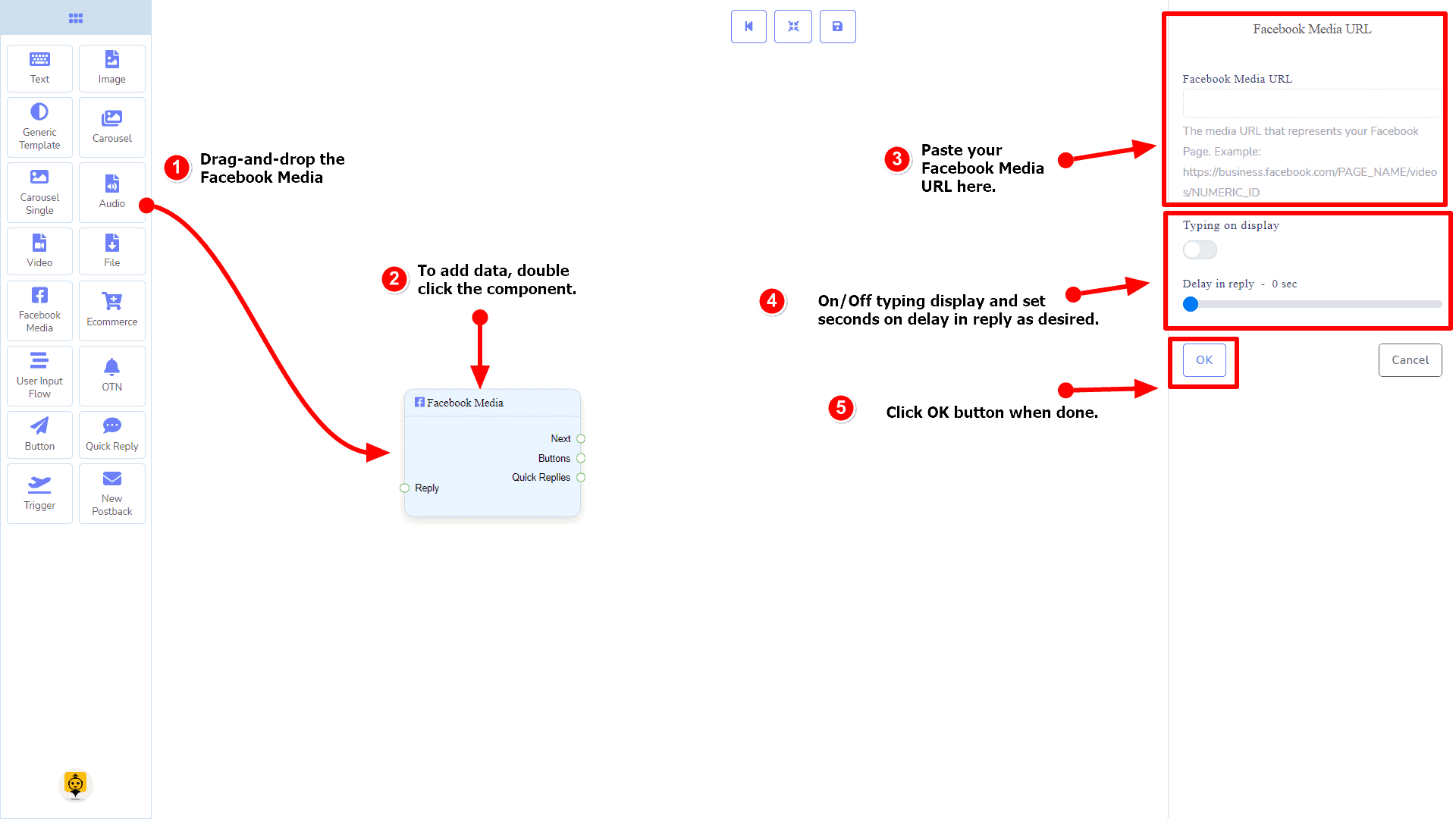
From the dock menu, drag the Facebook Media component and drop it on the editor at any place.
Adding Data
To add data to the Facebook Media component, click twice on the body of the Facebook Media component. It will open a sidebar on your right. Fill in the fields that you need.
Delay in Reply
If you want to show the typing gif image on the bot or delay in replying, then you can use those fields.
Ecommerce Component
Introduction
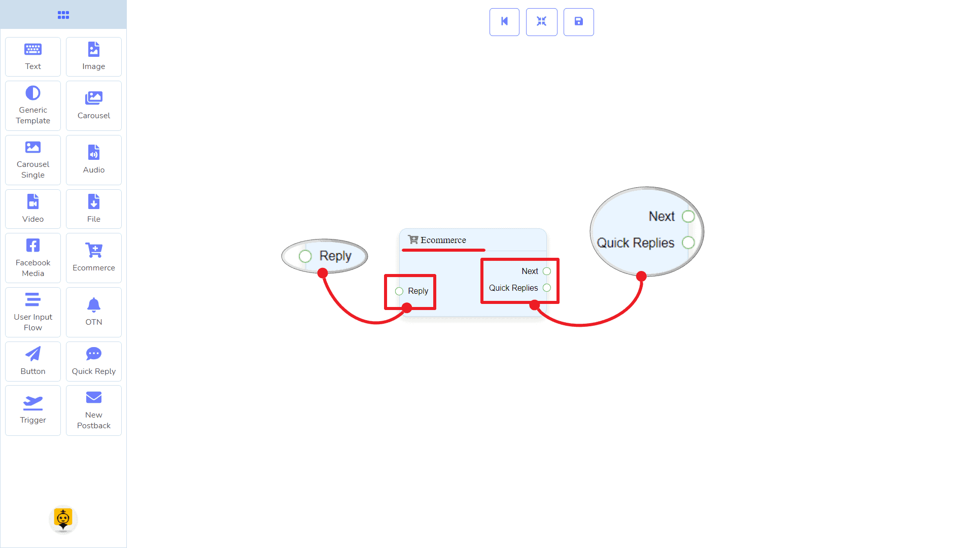
Ecommerce component will allow you to reply by referring to an ecommerce shop and its products as a carousel or generic reply. It has 1 input socket and 2 output sockets.
- Input: Reply
- Output: Next, and Quick Replies
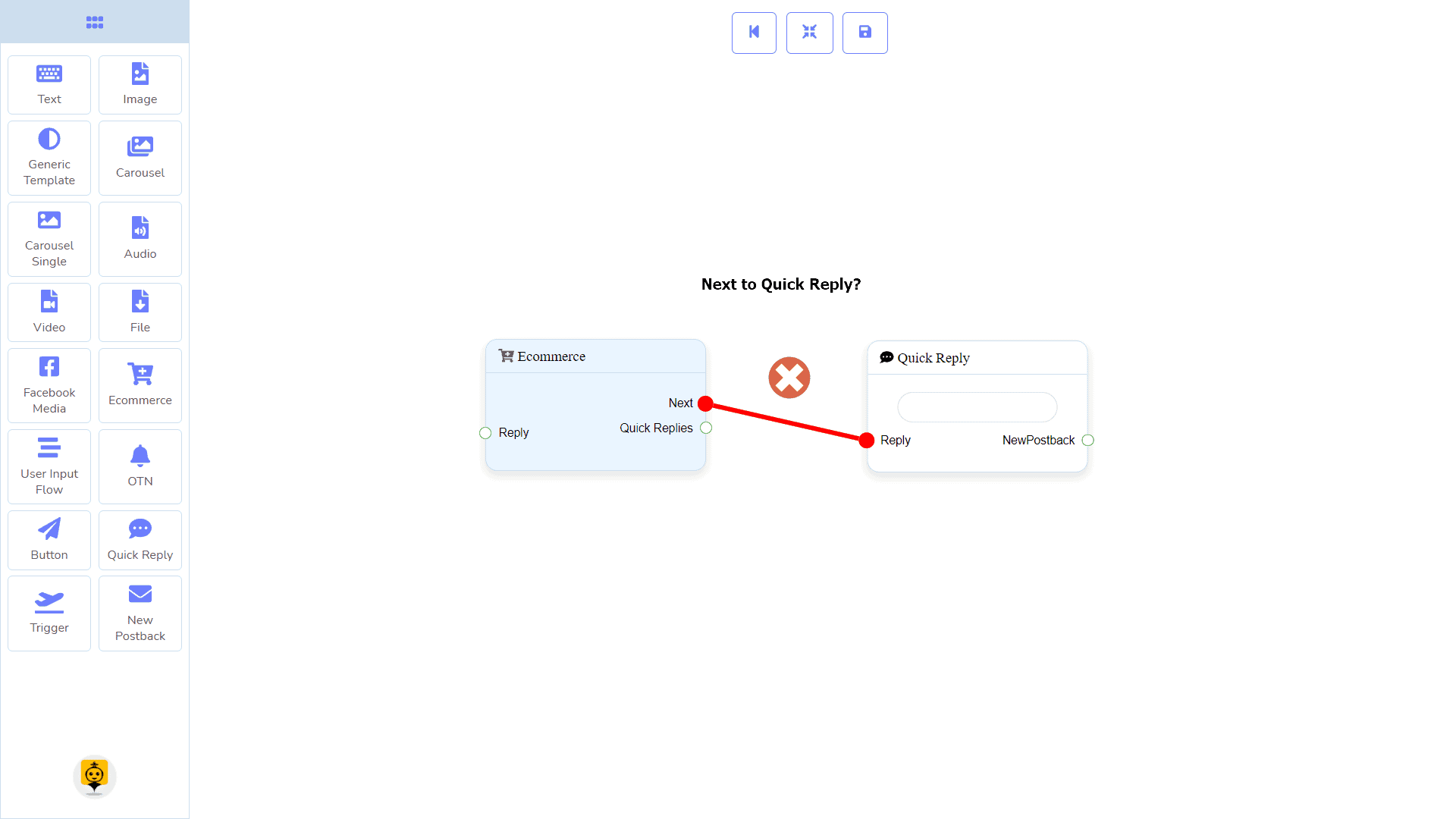
| Note: Next to Quick Replies!? |
| There is a condition between Next and Quick Replies. Using either Next or Quick Replies, you can connect to other components. But you can’t connect to others from both. |
Connections
The Reply may get connection from one of the following components:
- Start Bot Flow, New Postback, Text, Carousel, Facebook Media, Image, Video, Audio, File, Ecommerce, Generic Template, and OTN.
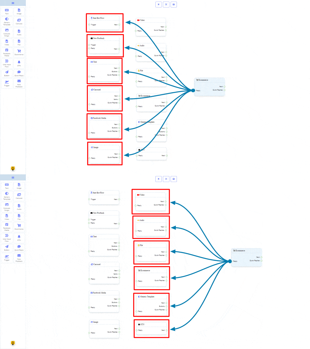
Next may be connected to one of the following components:
- Text, Carousel, Facebook Media, Image, Video, Audio, File, Ecommerce, User Input Flow, Generic Template, and OTN.
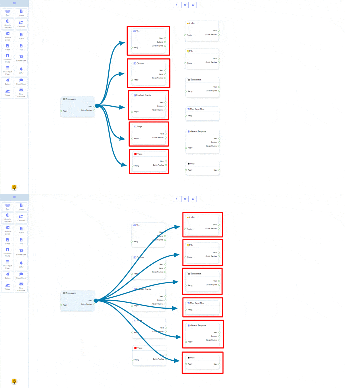
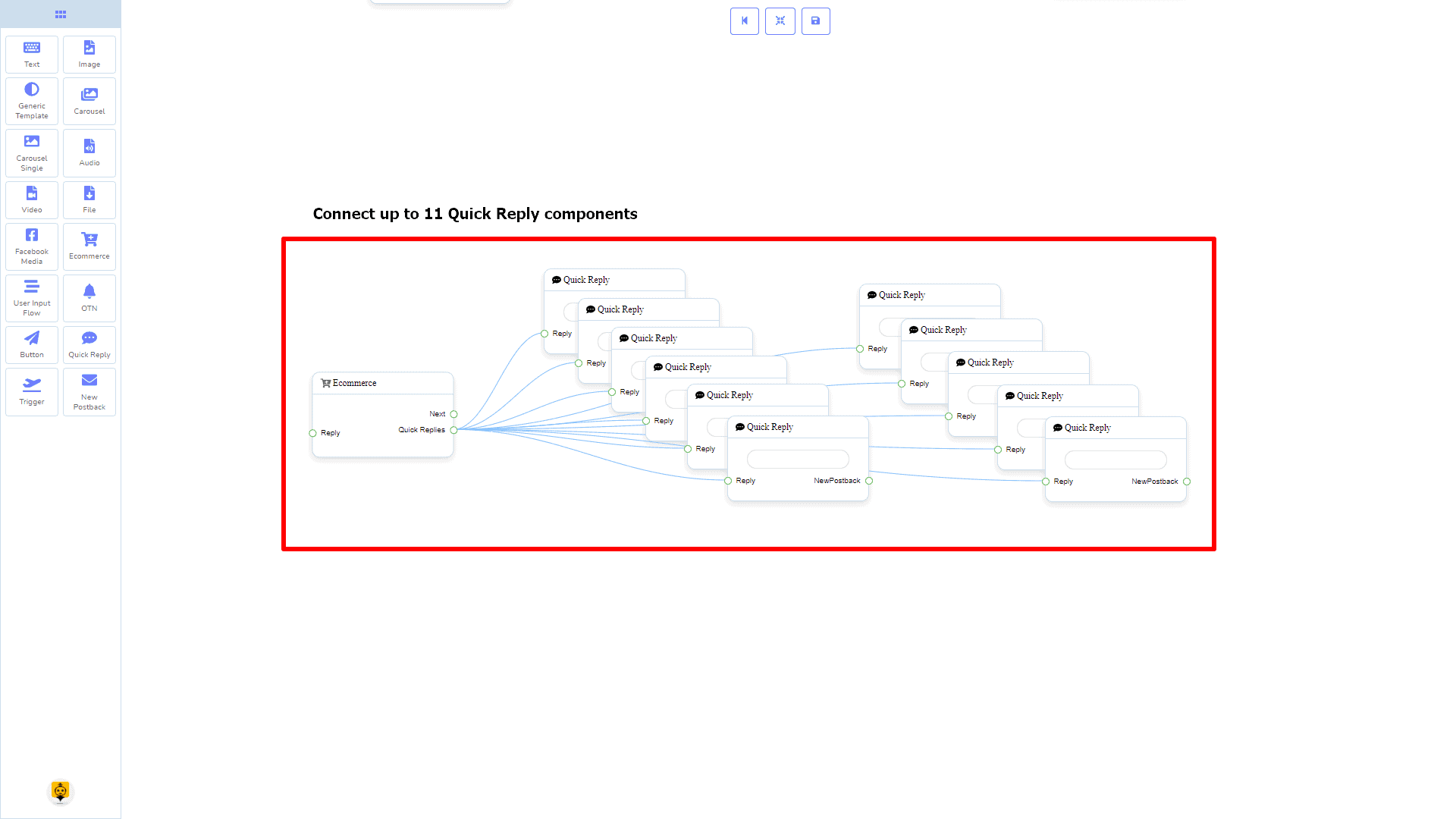
Quick Replies may be connected to the following component:
- Quick Reply – you may connect up to 11 Quick Replies to the Ecommerce component.
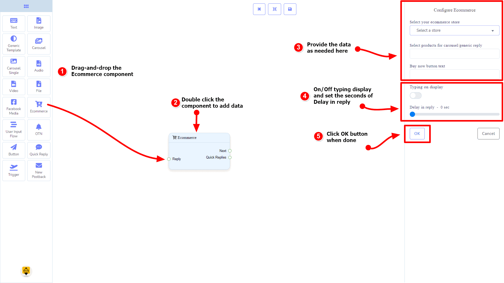
How to create an Ecommerce component
Let us see how we can create an ecommerce.
Dragging and Dropping
From the dock menu, drag the Ecommerce component and drop it on the editor at any place.
Adding Data
To add data to the Ecommerce component, click twice on the body of the Ecommerce component. It will open a sidebar on your right. Fill in the fields that you need.
Delay in Reply
If you want to show the typing gif image on the bot or delay in replying, then you can use those fields.
User Input Flow Component
Introduction
User Input Flow component will allow you to reply with a user input flow. It has only 1 input socket.
- Input: Reply
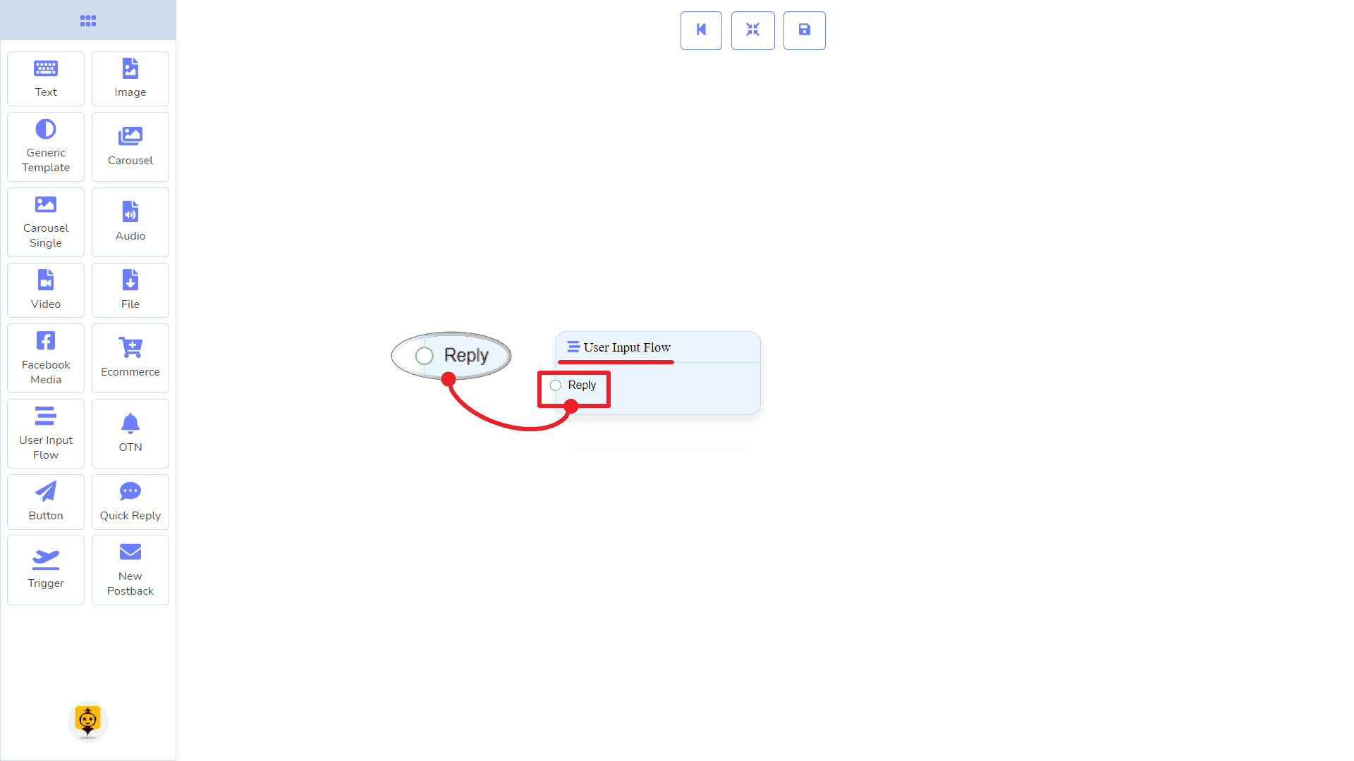
Connections
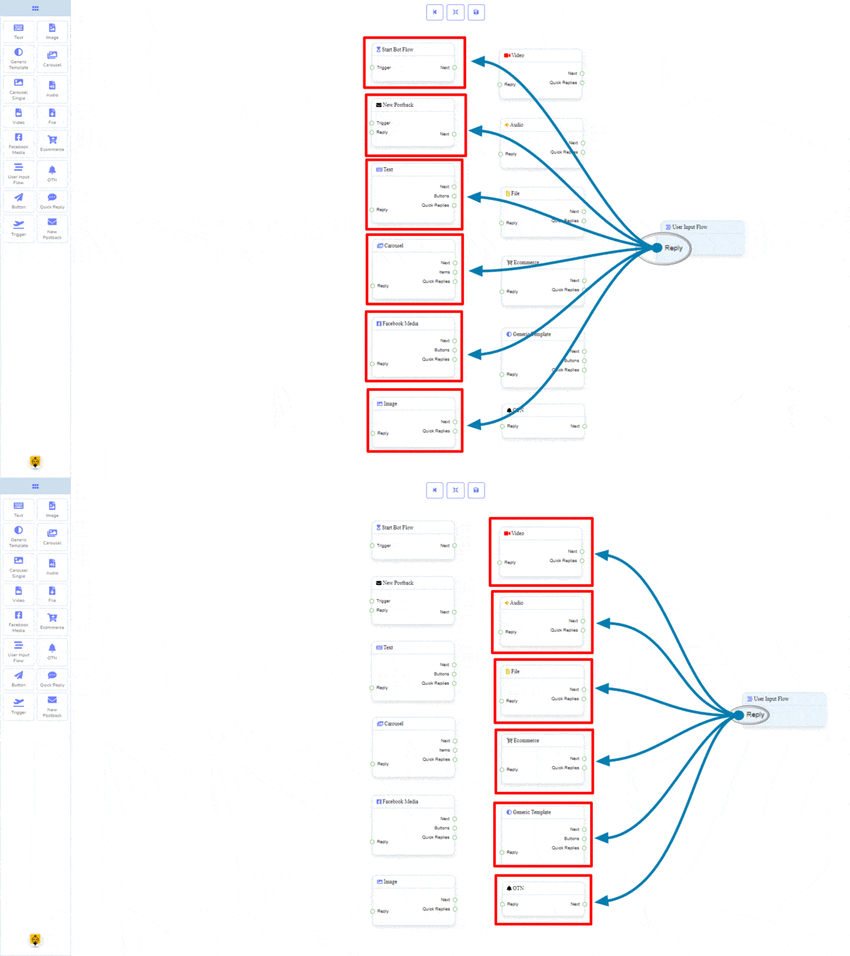
The Reply may get connection from one of the following components:
- Start Bot Flow, New Postback, Text, Carousel, Facebook Media, Image, Video, Audio, File, Ecommerce, Generic Template, and OTN.
How to create a User Input Flow component
Let us see how we can create a reply using the user-input-flow component.
Dragging and Dropping
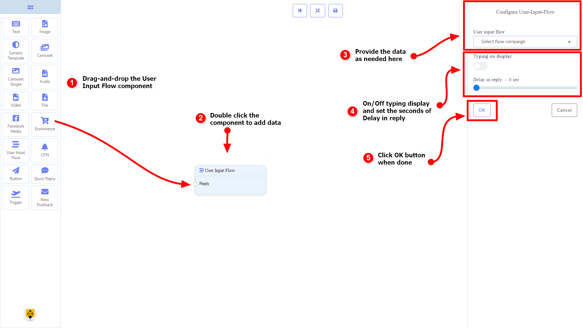
From the dock menu, drag the User Input Flow component and drop it on the editor at any place.
Adding Data
To add data to the User Input Flow component, click twice on the body of the User Input Flow component. It will open a sidebar on your right. Fill in the fields that you need.
OTN Component
Introduction
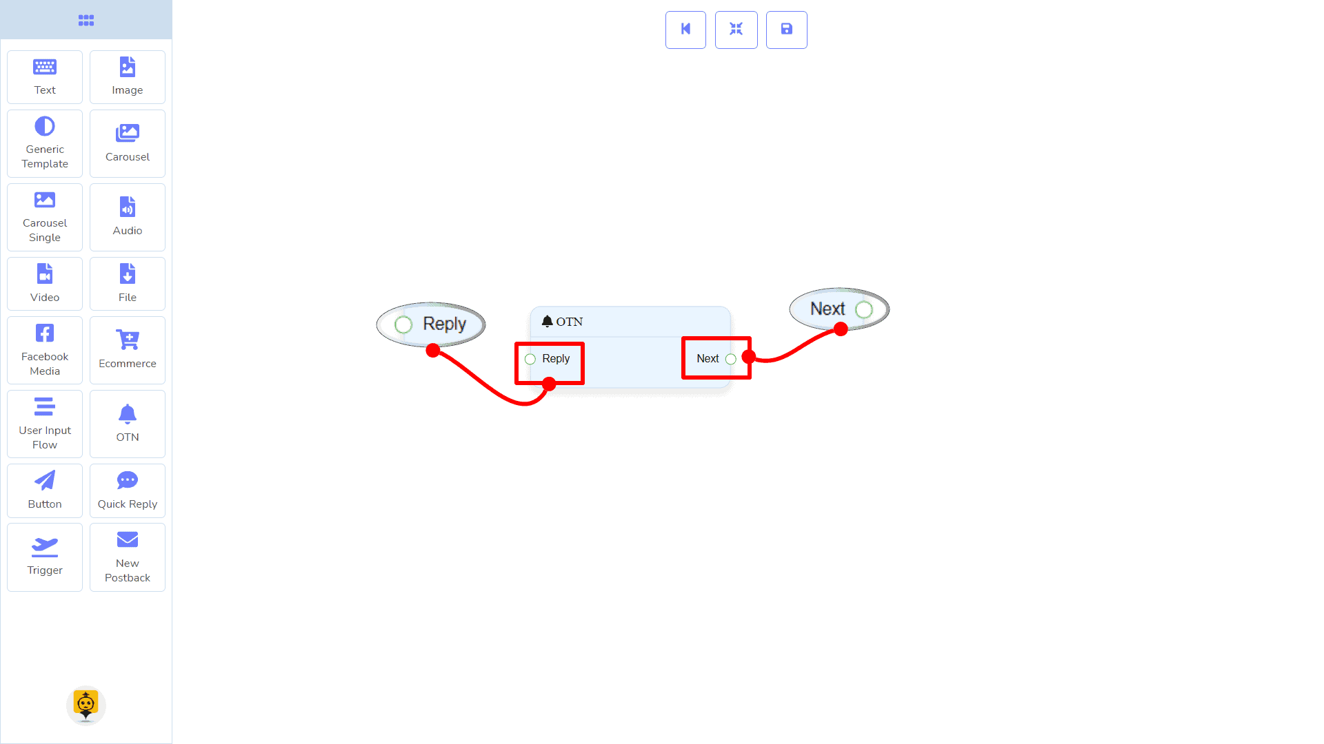
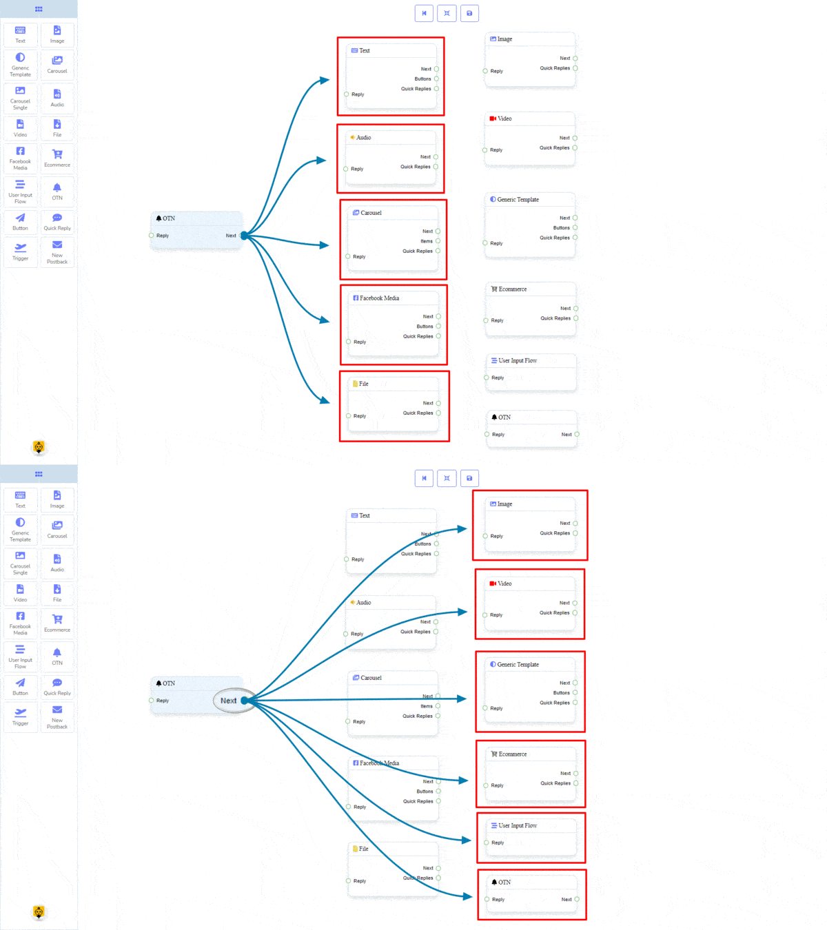
The OTN component will allow you to reply with One Time Notification. It has 1 input socket and 1 output socket.
- Input: Reply
- Output: Next
Connections
The Reply may get connection from one of the following components:
- Start Bot Flow, New Postback, Text, Carousel, Facebook Media, Image, Video, Audio, File, Ecommerce, Generic Template, and OTN.
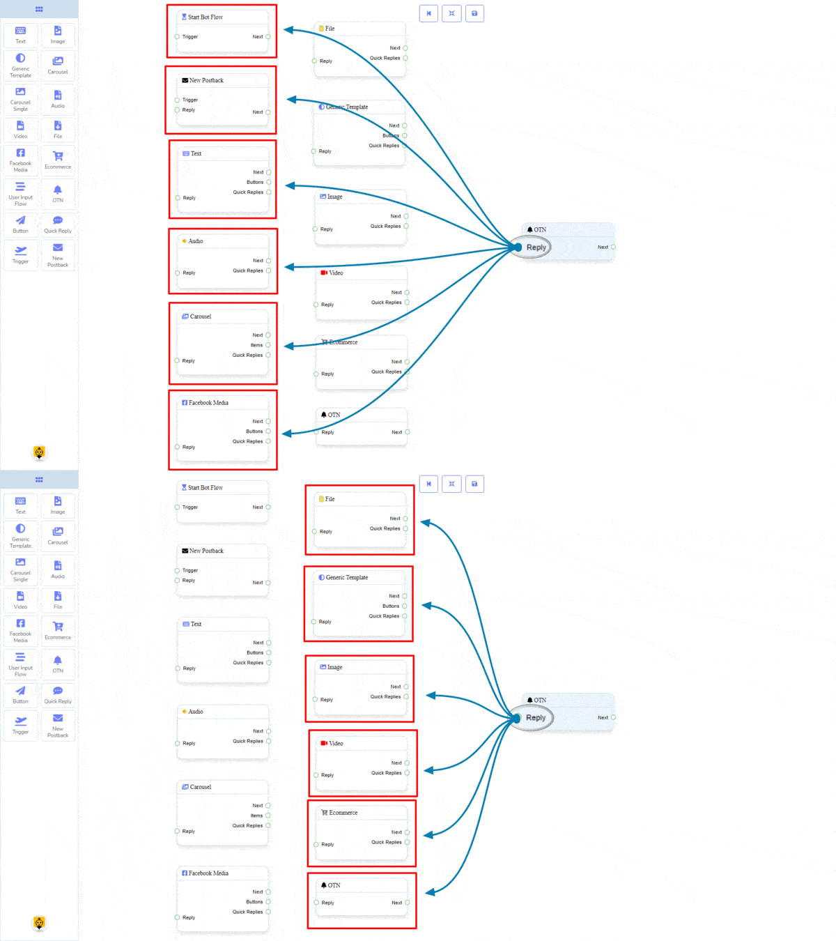
Next may be connected to one of the following components:
- Text, Carousel, Facebook Media, Image, Video, Audio, File, Ecommerce, User Input Flow, Generic Template, and OTN.
How to create an OTN component
Let us see how we can create a reply with one-time-notification.
Dragging and Dropping
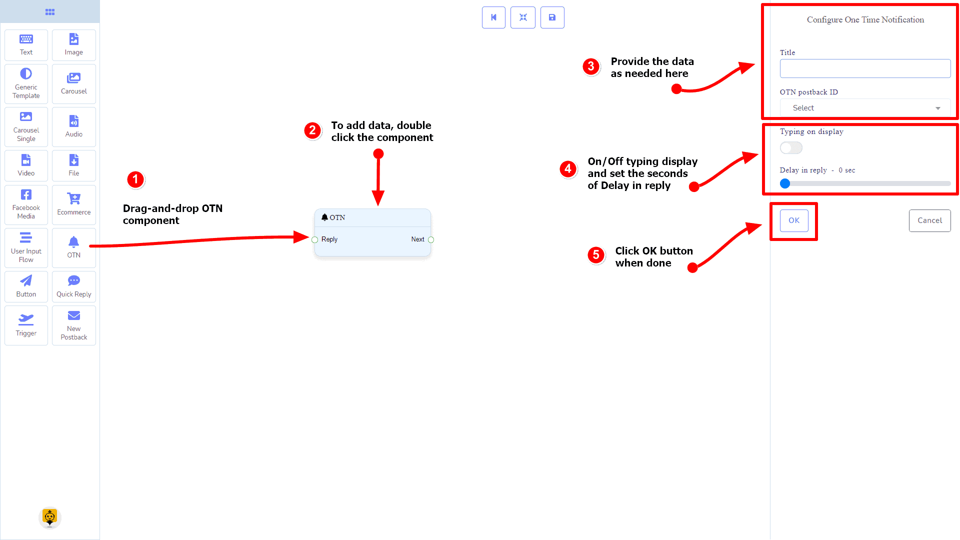
From the dock menu, drag the OTN component and drop it on the editor at any place.
Adding Data
To add data to the OTN component, click twice on the body of the OTN component. It will open a sidebar on your right. Fill in the fields that you need.
Delay in Reply
If you want to show the typing state on the bot or delay in replying, then you can use those fields.
Button Component
Introduction
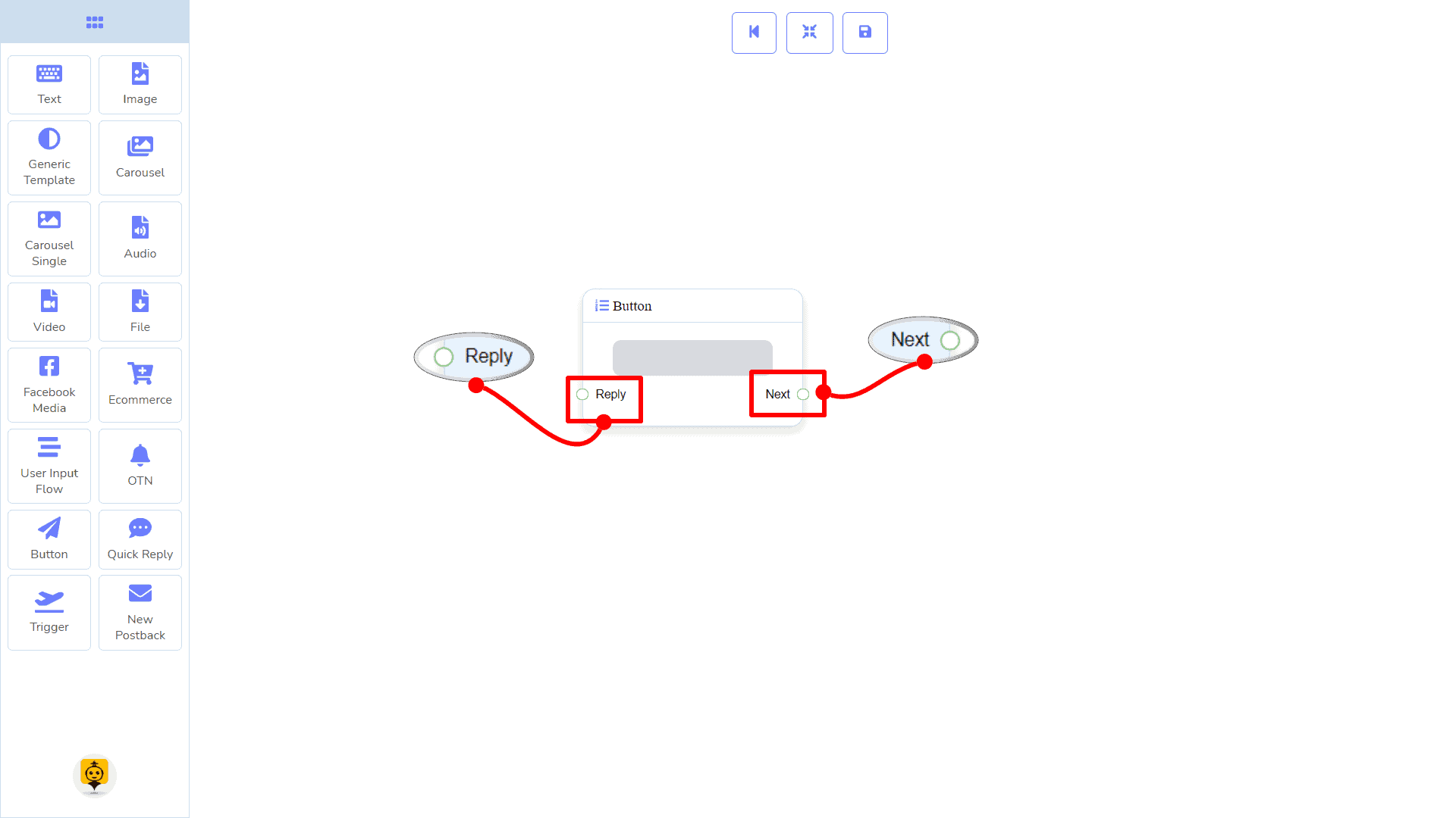
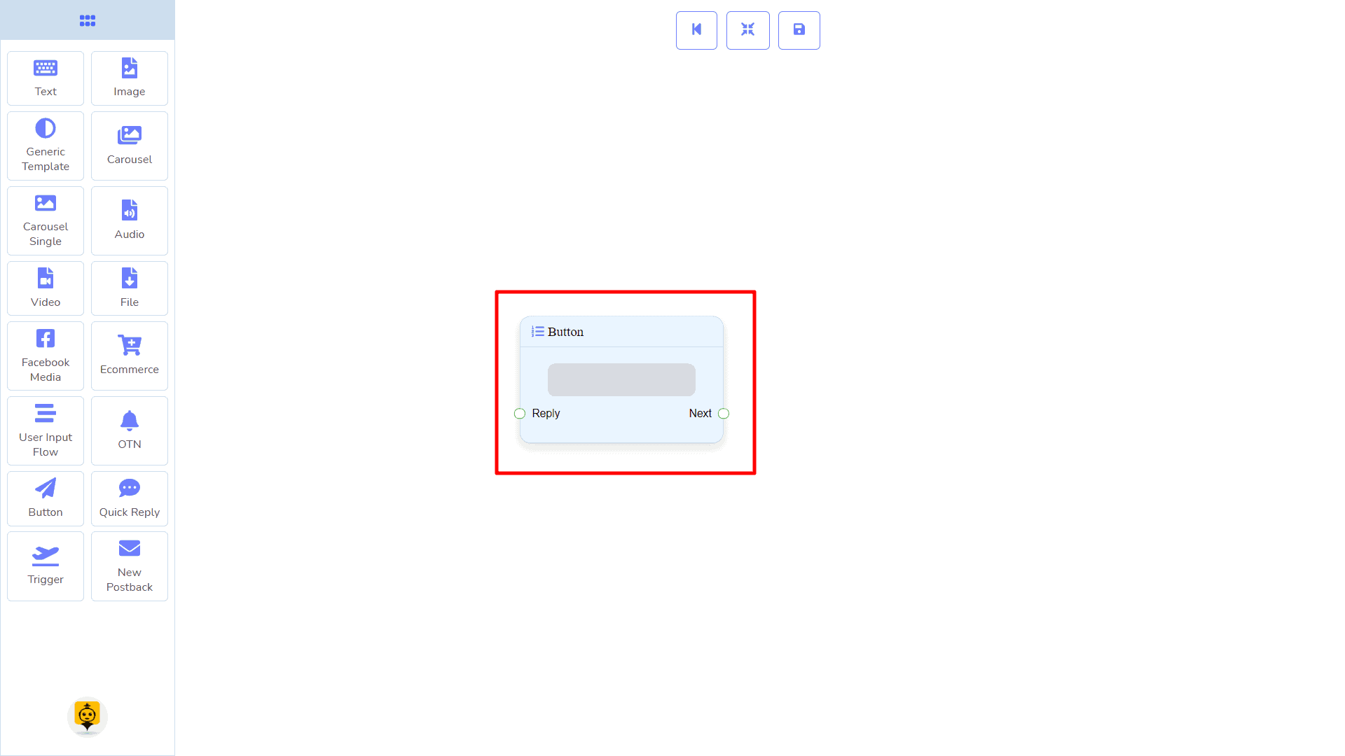
The Button component will allow you to reply with a button. It has only 1 input and 1 output.
- Input: Reply
- Output: Next
|
Note: Button Type Clarification |
| If the button type is something other than New Postback, then you can NOT connect this Button component to other components via its Next output socket. Because it only allows the New Postback component to be connected. See the connections section. |
Connections
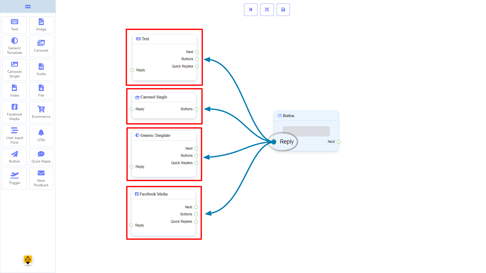
The Reply may get connection from one of the following components:
- Text, Carousel Single, Generic Template, and Facebook Media Button
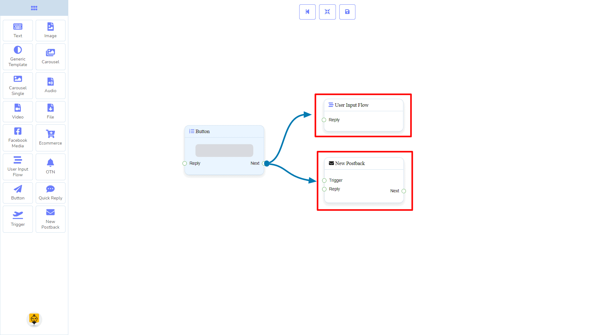
Next may be connected to one of the following components:
- User Input Flow and New Postback.
How to create a Button component
Let us see how we can create a reply with the help of the button component.
Dragging and Dropping
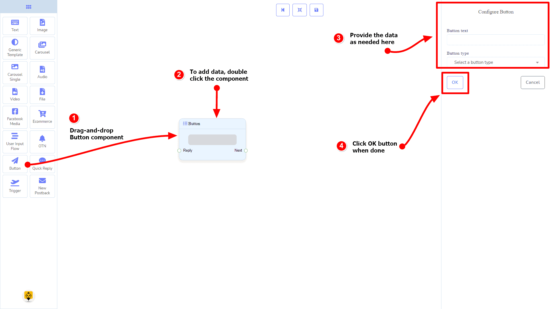
From the dock menu, drag the Button component and drop it on the editor at any place.
Adding Data
To add data to the Button component, click twice on the body of the Button component. It will open a sidebar on your right. Fill in the fields that you need.
Delay in Reply
If you want to show the typing state on the bot or delay in replying, then you can use those fields.
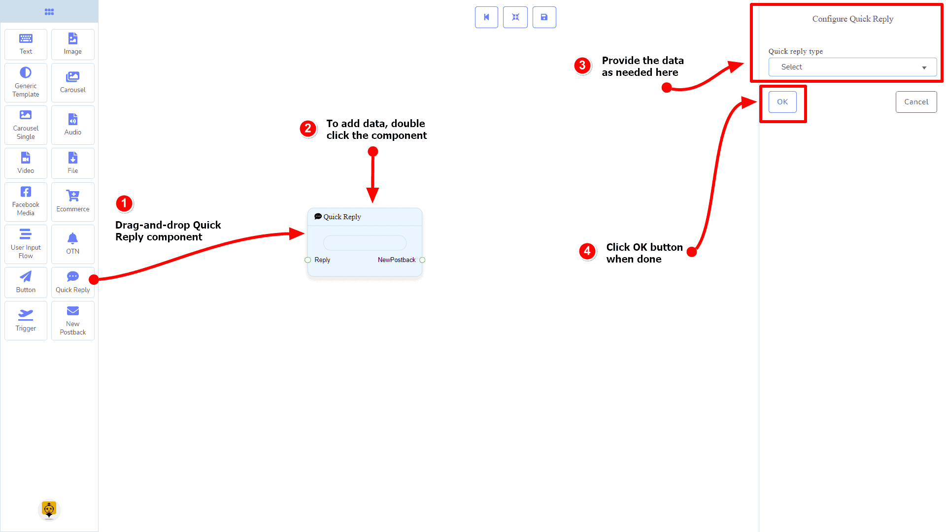
Quick Reply Component
Introduction
The Quick Reply component will allow you to reply quickly creating a New Postback, using an existing Postback, using your Facebook page’s Phone number or Email address. It has only 1 input socket and 1 output socket.
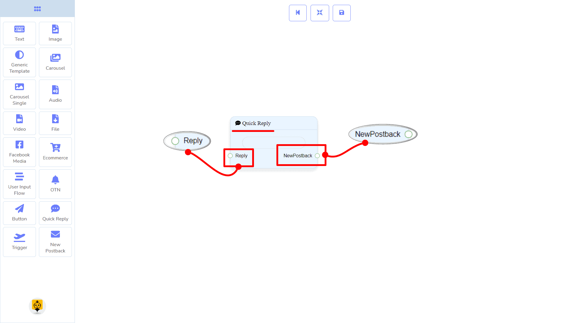
- Input: Reply
- Output: NewPostback
| Note: Quick Reply Type Clarification |
| If your quick-reply type is something other than New Postback, then you can NOT connect this Quick Reply component to other components via its New Postback output socket. Because it only allows the New Postback component to be connected. See the connections section. |
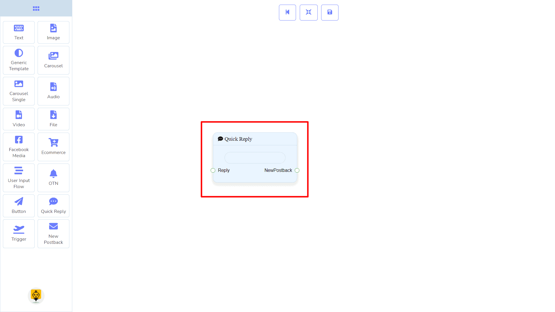
Connections
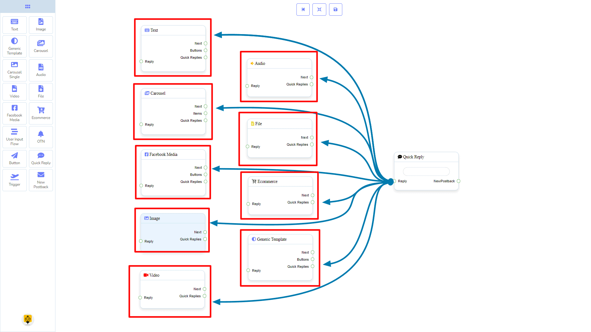
The Reply may get connection from one of the following components:
- Text, Carousel, Facebook Media Button, Image, Video, Audio, File, Ecommerce, and Generic Template,
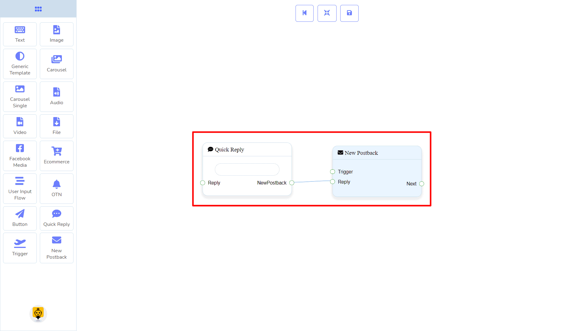
Next may be connected to the following components:
- New Postback.
How to create a Quick Reply component
Let us see how we can create a quick reply.
Dragging and Dropping
From the dock menu, drag the Quick Reply component and drop it on the editor at any place.
Adding Data
To add data to the Quick Reply component, click twice on the body of the Quick Reply component. It will open a sidebar on your right. Fill in the fields that you need.
